# 各种布局的套路
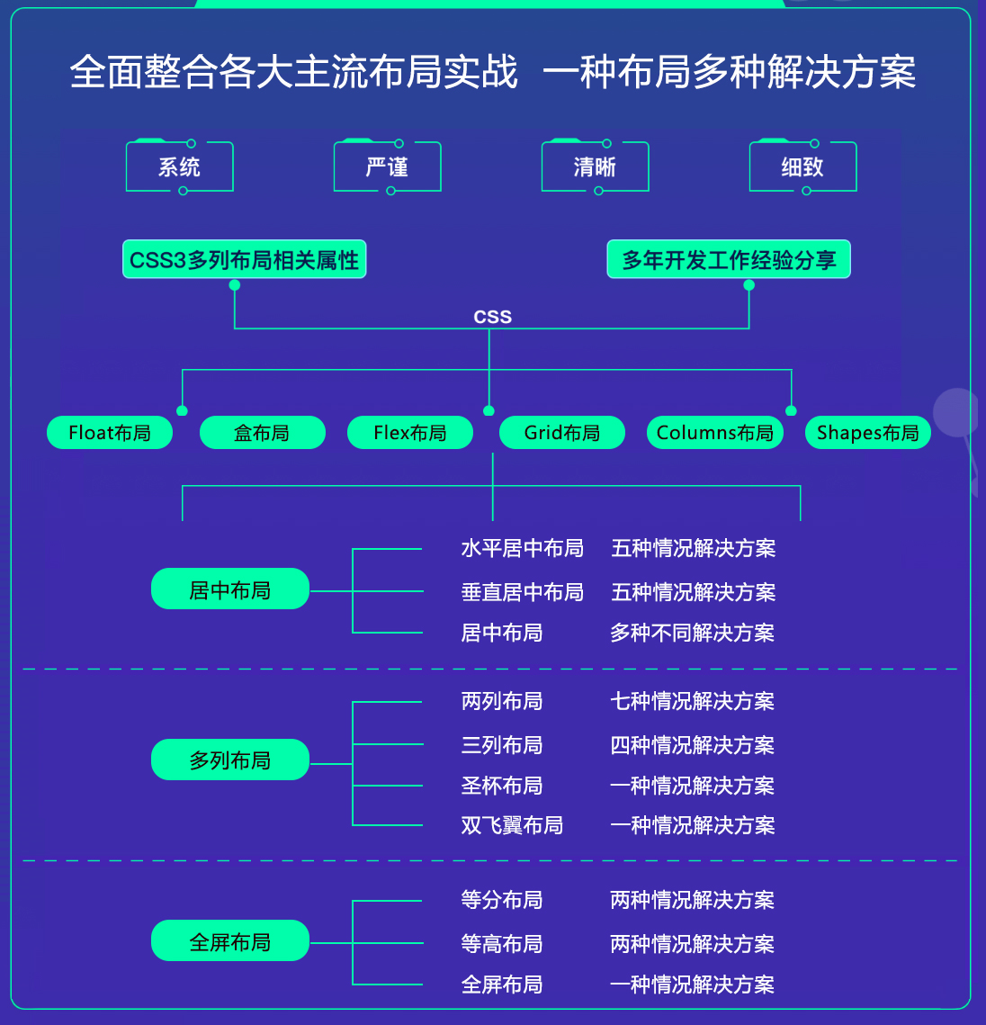
- 什么是布局?
简单来说就是HTML页面的整体结构或骨架,类似于传统的报纸或杂志中的排版;
# table 布局 (基本不用了)
display: table
display: table-cell /*相当于td元素*/
display: table-row /*相当于tr元素*/
table-layout: fixed | auto(默认)
2
3
4
# float 布局
- 特点:
- 元素 "浮动"
- 脱离文档流
- 但不脱离文本流
- 影响:
- 对自身的影响: 形成"块"(BFC 格式化上下文)、位置尽量靠上、位置尽量靠左(右),无法满足会靠下
- 对兄弟的影响: 上面贴非 float 元素、旁边贴 float 元素、不影响其它块级元素位置、影响其它块级元素内部文本
- 对父级的影响: 从布局上"消失"、高度塌陷(overflow: hidden | clearfix)
- 实践: float + margin
- 两列布局
- 三列布局
- 清除浮动
/* 伪元素 */
.clearfix:after {
  content: "";
  display: block;
  height: 0;
  clear: both;
  visibility: hidden;
}
.clearfix {
  /* 触发 hasLayout */
  zoom: 1;
}
2
3
4
5
6
7
8
9
10
11
12
.box {
  overflow: hidden | (auto)
}
2
3
.box {
  display: inline-block;
}
2
3
- BFC
BFC(Block formatting context) 直译为 "块级格式化上下文"。😏 它是一个独立的渲染区域,只有块级元素(Block-level box)参与, 它规定了内部的块级元素(Block-level box)如何布局,并且与这个区域外部毫不相干。说白了,它就是页面上的一个隔离的独立容器,容器里面的子元素不会影响到外面元素, 反之亦然。

- 触发 BFC
CSS2.1中规定满足下列CSS声明之一的元素便会生成BFC
- 根元素
- float 的值不为 none
- overflow 的值不为 visible
- display 的值为 inline-block、table-cell、table-caption
- display:table 也认为可以生成BFC,其实这里的主要原因在于 table 会默认生成一个匿名的table-cell,正是这个匿名的 table-cell生成了 BFC
- position 的值为 absolute 或 fixed
# inline-block 布局 (我最简答,😸 😸)
特点:
- 像文本一样排 block 元素
- 没有清除浮动等问题
- 需要处理间隙(父元素: font-size: 0)
# Flexbox 布局
布局的传统解决方案,基于盒状模型依赖 display 属性 + position属性 + float属性。它对于那些特殊布局非常不方便,比如,垂直居中就不容易实现;
2009年,W3C 提出了一种新的方案 Flex 布局,可以简便、完整、响应式地实现各种页面布局。目前,它已经得到了所有浏览器的支持,这意味着,现在就能很安全地使用这项功能。
Flex是 Flexible Box 的缩写,意为"弹性布局",用来为盒状模型提供最大的灵活性;任何一个容器都可以指定为Flex布局,行内元素也可以使用Flex布局; webkit 内核的浏览器,必须加上-webkit-前缀。
/* 全兼容写法:  */
display: -webkit-box; /* Chrome 4+, Safari 3.1, iOS Safari 3.2+ */
display: -moz-box; /* Firefox 17- */
display: -webkit-flex; /* Chrome 21+, Safari 6.1+, iOS Safari 7+, Opera 15/16 */
display: -moz-flex; /* Firefox 18+ */
display: -ms-flexbox; /* IE 10 */
display: flex; /* Chrome 29+, Firefox 22+, IE 11+, Opera 12.1/17/18, Android 4.4+ */
2
3
4
5
6
7
| flex容器 | flex子项 |
|---|---|
| flex-direction | order |
| flex-wrap | flex-grow |
| flex-flow | flex-shrink |
| justify-content | flex-basis |
| align-items | flex |
| align-content | align-self |
- flex-direction
flex-direction 属性决定主轴的方向(即项目的排列方向)。
.box {
  flex-direction: row | row-reverse | column | column-reverse;
}
2
3
取值:
- row(默认值):主轴为水平方向,起点在左端
- row-reverse:主轴为水平方向,起点在右端
- column:主轴为垂直方向,起点在上沿
- column-reverse:主轴为垂直方向,起点在下沿
- flex-wrap
默认情况下,项目都排在一条线(又称"轴线")上。flex-wrap 属性定义,如果一条轴线排不下,如何换行。
.box{
  flex-wrap: nowrap | wrap | wrap-reverse;
}
2
3
取值:
- nowrap(默认):不换行
- wrap:换行,第一行在上方
- wrap-reverse:换行,第一行在下方
- flex-flow
flex-flow 属性是 flex-direction 属性和 flex-wrap 属性的简写形式,默认值为 row nowrap。
.box {
  flex-flow: <flex-direction> || <flex-wrap>;
}
2
3
- justify-content
justify-content 属性定义了项目在主轴上的对齐方式。
.box {
  justify-content: flex-start | flex-end | center | space-between | space-around;
}
2
3
取值:
- flex-start(默认值):左对齐
- flex-end:右对齐
- center: 居中
- space-between:两端对齐,项目之间的间隔都相等。
- space-around:每个项目两侧的间隔相等。所以,项目之间的间隔比项目与边框的间隔大一倍
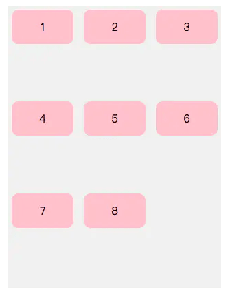
space-between space-around 属性用的时候非常有意思,如果想实现下面的布局。
<ul>
    <li>1</li>
    <li>2</li>
    <li>3</li>
    <li>4</li>
    <li>5</li>
    <li>6</li>
    <li>7</li>
    <li>8</li>
</ul>
<style>
  ul {
    width: 300px;
    height: 400px;
    background: #f0f0f0;
    list-style: none;
    display: flex;
    flex-direction: row;
    flex-wrap: wrap;
    justify-content: space-between;
    padding: 5px;
  }
  ul li {
    width: 90px;
    height: 50px;
    text-align: center;
    line-height: 50px;
    background: pink;
    border-radius: 10px;
  }
  /* 采用伪元素解决 */
  ul:after{
    content: '';
    width: 90px;
 }
</style>
2
3
4
5
6
7
8
9
10
11
12
13
14
15
16
17
18
19
20
21
22
23
24
25
26
27
28
29
30
31
32
33
34
35
36
- align-items
align-items属性定义项目在交叉轴上如何对齐。
.box {
  align-items: flex-start | flex-end | center | baseline | stretch;
}
2
3
取值:
- flex-start:交叉轴的起点对齐
- flex-end:交叉轴的终点对齐
- center:交叉轴的中点对齐
- baseline: 项目的第一行文字的基线对齐
- stretch(默认值):如果项目未设置高度或设为auto,将占满整个容器的高度
- align-content
align-content属性定义了多根轴线的对齐方式。如果项目只有一根轴线,该属性不起作用。(到目前没用过😏)
.box {
  align-content: flex-start | flex-end | center | space-between | space-around | stretch;
}
2
3
取值:
- flex-start:与交叉轴的起点对齐。
- flex-end:与交叉轴的终点对齐。
- center:与交叉轴的中点对齐。
- space-between:与交叉轴两端对齐,轴线之间的间隔平均分布。
- space-around:每根轴线两侧的间隔都相等。所以,轴线之间的间隔比轴线与边框的间隔大一倍。
- stretch(默认值):轴线占满整个交叉轴。
- order
order 属性定义项目的排列顺序。数值越小,排列越靠前,默认为0。
- flex-grow
flex-grow 属性定义项目的放大比例,默认为0,即如果存在剩余空间,也不放大。
- flex-shrink
flex-shrink 属性定义了项目的缩小比例,默认为1,即如果空间不足,该项目将缩小。(这个属性其实就是定义一个子容器的压缩比例)
- flex-basis
flex-basis 属性定义了在分配多余空间之前,项目占据的主轴空间(main size)。浏览器根据这个属性,计算主轴是否有多余空间。它的默认值为auto,即项目的本来大小。(这个属性值的作用也就是width的替代品,如果同时设置flex-basis和width,那么width属性会被覆盖,也就是说flex-basis的优先级比width高。)
- flex
flex 属性是 flex-grow, flex-shrink 和 flex-basis的简写,默认值为0 1 auto。后两个属性可选。
# Grid 布局
网格布局(Grid)是最强大的 CSS 布局方案。
- 它将网页划分成一个个网格,可以任意组合不同的网格,做出各种各样的布局。以前,只能通过复杂的CSS框架达到的效果,现在浏览器内置了;
- Grid 布局与 Flex 布局有一定的相似性,都可以指定容器内部多个项目的位置。但是,它们也存在重大区别。
- Flex 布局是轴线布局,只能指定"项目"针对轴线的位置,可以看作是一维布局。Grid 布局则是将容器划分成"行"和"列",产生单元格,然后指定"项目所在"的单元格,可以看作是二维布局。Grid 布局远比Flex布局强大。
这个布局是真没有过,然后看了下面的文章,一个头两个大,等看完后再做总结 ┭┮﹏┭┮
# Columns 布局
# Shapes 布局
# 居中布局
- 水平居中布局
当前元素在父级元素容器中,水平方向是居中显示的
- inline-block + text-align 属性配合使用 (文本/行内元素/行内块元素 )
原理:text-align 只控制行内内容(文字、行内元素、行内块级元素)如何相对他的父元素对齐
优点: 浏览器兼容性比较好
缺点:只对函内内容有效,属性会继承影响到后代行内内容。如果子元素宽度大于父元素宽度则无效,只有后代行内内容中宽度小于设置 text-align 属性的元素宽度的时候,才会水平居中。
 <div class="parent">
  <div class="child">小铜钱儿</div>
</div>
2
3
.parent {
  width: 100%;
  height: 200px;
  background: #ccc;
  text-align: center; /* 😸 😸 */
}
.child {
  display:inline-block; /* 😸 😸 */
  width: 200px;
  height: 200px;
  background: #c9394a;
}
2
3
4
5
6
7
8
9
10
11
12

- 单个块级元素
原理:在 margin 有节余的同时如果左右 margin 设置了 auto ,将会均分剩余空间。另外如果上下的值设置了 auto,其计算值为 0。
优点:简单,兼容性好
缺点:子元素必须定宽,并且值不能为 auto,宽度要小于元素,否则无效。
<div class="parent">
  <div class="child">小铜钱儿</div>
</div>
2
3
.parent {
  width: 100%;
  height: 200px;
  background: #ccc;
  text-align: center;
}
.child {
  /* 必须定宽 */
  width: 200px;
  background: #c9394a;
  margin: 0 auto; /* 😸 😸 */
}
2
3
4
5
6
7
8
9
10
11
12

- 多个块级元素
原理:text-align 只控制行内内容(文字、行内元素、行内块级元素)如何相对他的父元素对齐
优点:简单,容易理解,兼容性非常好
缺点:只对行内内容有效,属性会继承影响到后代行内内容,块级改为 inline-block 换行,空格会产生元素间隔(给父元素添加 font-size:0 可以去除间隔,同时需要给子元素设置字体大小)
<div class="parent">
  <div class="child">小铜钱儿1</div>
  <div class="child">小铜钱儿2</div>
  <div class="child">小铜钱儿3</div>
</div>
2
3
4
5
.parent {
  width: 100%;
  height: 200px;
  background: #ccc;
  text-align: center; /* 😸 😸 */
}
.child {
  display:inline-block; /* 😸 😸 */
  width: 200px;
  height: 200px;
  background: #c9394a;
}
2
3
4
5
6
7
8
9
10
11
12

- 使用绝对定位实现
原理:子绝对定位父相对定位,top、right、bottom、left的值是相对于父元素尺寸的,然后 margin 或者 transform 是相对于自身尺寸的,组合使用达到水平居中。
优点: 使用 margin-left 兼容性好,不管是块元素还是行内元素都可以实现。父级元素是否脱离文档流,不影响子级元素水平居中效果
缺点:代码较多,脱离文档流,使用 margin-left 需要知道宽度值,使用 transform 兼容性不好(IE9+)。
<div class="parent">
  <div class="child">小铜钱儿</div>
</div>
2
3
.parent {
  width: 100%;
  height: 200px;
  background: #ccc;
  position: relative;
}
.child {
  width: 200px;
  height: 200px;
  background: #c9394a;
  position: absolute;
  left: 50%;
  /* margin-left: -100px; 自身宽度的一半儿 */
  transform: translateX(-50%);/* 😸 😸 */
}
2
3
4
5
6
7
8
9
10
11
12
13
14
15

- 使用 Flex (任意个元素)
原理:设置当前主轴对齐方式为居中
优点:功能强大,简单方便,容易理解
缺点:PC端兼容不友好,移动端(Android4.0+)
<div class="parent">
  <div class="child">小铜钱儿</div>
  <div class="child">小铜钱儿</div>
</div>
2
3
4
.parent {
  width: 100%;
  height: 200px;
  background: #ccc;
  display: flex;
  justify-content: center;/* 😸 😸 */
}
.child {
  width: 200px;
  height: 200px;
  background: #c9394a;
  margin-left: 10px;
}
2
3
4
5
6
7
8
9
10
11
12
13

- 垂直居中布局
当前元素在父级元素容器中,垂直方向是居中显示的
- 单行文本/行内元素/行内块元素
原理:line-height 的最终表现是通过 line box 实现的,而无论inline box 所占据的高度是多少(无论比文字大还是比文字小),其占据的空间都是文字内容公用水平居中垂线。
优点:简单,兼容性好
缺点:只能用于单行行内内容,要知道高度值,多用于文字垂直居中。
<div class="parent">
  <div class="child">小铜钱儿</div>
</div>
2
3
.parent {
  width: 100%;
  height: 200px;
  line-height: 200px; /* 😸 😸 */
  background: #ccc;
}
.child {
  width: 200px;
  background: #c9394a;
}
2
3
4
5
6
7
8
9
10

- 图片垂直居中
原理:vartical-align 和 line-height
优点:简单,兼容性好
缺点:需要添加 font-size: 0;才可以完全的垂直居中
<div class="parent">
  <img
  class="child"
  src="https://ss0.bdstatic.com/70cFvHSh_Q1YnxGkpoWK1HF6hhy/it/u=3693471117,4023283423&fm=26&gp=0.jpg">
</div>
2
3
4
5
.parent {
  width: 100%;
  height: 200px;
  line-height: 200px; /* 😸 😸 */
  background: #ccc;
}
.child {
  vertical-align: middle; /* 😸 😸 */
  height: 50px;
}
2
3
4
5
6
7
8
9
10

- 单个块级元素
使用 table-cell 实现
原理:CSS Table 中使表格内容对齐方式为 middle
优点:简单,宽高不定,兼容性好(IE8+)
缺点:设置 table-cell 的元素,宽度和高度的值设置百分比无效,需要给他的父元素设置 display: table 才生效;table-cell 不感知 margin,在父元素上设置table-row 等属性,也会使其不感知 height;设置 floag 或 position 会对默认布局造成破坏,可以考虑为之增加一个父 div 定义 float等属性;内容溢出时会自动撑开父元素。
<div class="parent">
  <div class="child">小铜钱儿</div>
</div>
2
3
.parent {
  width: 100%;
  height: 200px;
  display: table-cell;
  vertical-align: middle;
  background: #ccc;
}
.child {
}
2
3
4
5
6
7
8
9

- 使用绝对定位 position 实现
原理:子元素绝对定位父元素相对定位,top、right、bottom、left 的值是相对于父元素尺寸的,然后margin或者transform 是相对于自身尺寸的,组合使用达到水平居中的目的。
优点: 使用 margin-top 兼容性好,不管是块元素还是行内元素都可以实现。父级元素是否脱离文档流,不影响子级元素水平居中效果
缺点:代码较多,脱离文档流,使用 margin-top 需要知道宽度值,使用 transform 兼容性不好(IE9+)。
<div class="parent">
  <div class="child">小铜钱儿</div>
</div>
2
3
.parent {
  width: 100%;
  height: 200px;
  position: relative;
  background: #ccc;
}
.child {
  width: 200px;
  height: 50px;
  position: absolute;
  top:  50%;
  /* margin-top:  -25px; */ /* 😸 😸 */
  transform: translateY(-50%); /* 😸 😸 */
  background: #c9394a;
}
2
3
4
5
6
7
8
9
10
11
12
13
14
15
.child {
  width: 200px;
  height: 50px;
  position: absolute; /* 😸 😸 */
  margin: auto; /* 😸 😸 */
  top: 0; /* 😸 😸 */
  bottom: 0; /* 😸 😸 */
  background: #c9394a;
}
2
3
4
5
6
7
8
9

- Flex 垂直居中 (结构、优缺点参考flex水平居中)
原理:flex设置对齐方式
.parent {
  width: 100%;
  height: 200px;
  background: #ccc;
  display: flex;
  align-items: center;/* 😸 😸 */
}
2
3
4
5
6
7

- 水平垂直居中 (敲黑板 😒)
当前元素在父级元素容器里,水平垂直方向都是居中显示的
- table + margin 实现水平方向居中,table-cell + vertical-align 实现垂直方向居中
原理:CSS Table ,使表格内容垂直对齐方式为 middle,然后根据是行内元素还是块级元素采取不同的方式水平居中。
优点:简单,适用于宽高未知情况,兼容性好(IE8+)
缺点:vertical-align 属性具有继承性,导致父元素的文本也是居中显示的
<div class="parent">
  <div class="child">小铜钱儿</div>
</div>
2
3
.parent {
  width: 900px;
  height: 200px;
  background: #ccc;
  display: table-cell; /* 😸 😸 */
  vertical-align: middle; /* 😸 😸 */
  text-align: center; /* 如果是行内元素添加这个 */
}
.child {
  margin:  0 auto; /* 😸 😸 */ /* 如果是块元素添加这个 */
  width: 100px;
  height: 100px;
  background: #c9394a;
}
2
3
4
5
6
7
8
9
10
11
12
13
14

- 使用绝对定位 position 实现
原理:子元素绝对定位父元素相对定位,top、right、bottom、left 的值是相对于父元素尺寸的,然后margin或者transform 是相对于自身尺寸的,组合使用达到水平垂直居中的目的。
优点: 使用 margin 兼容性好,不管是块元素还是行内元素都可以实现。父级元素是否脱离文档流,不影响子级元素水平居中效果
缺点:代码较多,脱离文档流,使用 margin 需要知道宽高值,使用 transform 兼容性不好(IE9+)
<div class="parent">
  <div class="child">小铜钱儿</div>
</div>
2
3
.parent {
  width: 900px;
  height: 200px;
  background: #ccc;
  position: relative;
}
.child {
  position: absolute;
  top:  50%;
  left:  50%;
  /* margin: -50px -50px; */ /* 😸 😸 */
  transform: translate(-50%, -50%); /* 😸 😸 */
  width: 100px;
  height: 100px;
  background: #c9394a;
}
2
3
4
5
6
7
8
9
10
11
12
13
14
15
16
.child {
  position: absolute;
  top:  0; /* 😸 😸 */
  left:  0; /* 😸 😸 */
  bottom: 0; /* 😸 😸 */
  right: 0; /* 😸 😸 */
  margin: auto; /* 😸 😸 */
  width: 100px;
  height: 100px;
  background: #c9394a;
}
2
3
4
5
6
7
8
9
10
11

- flex (非常实用 !!)
.parent {
  width: 900px;
  height: 200px;
  background: #ccc;
  display: flex;
  justify-content: center;
  align-items: center;
}
2
3
4
5
6
7
8
总结:
- 行内/行内块级/图片: 原理:text-align: center; 控制行内内容相对于块父元素水平居中, 然后就是line-height 和 vertical-align 的基友关系使其垂直居中,font-size: 0; 是为了消除近似居中的 bug
- table-cell: CSS Table,使表格内容垂直对齐方式为 middle,然后根据是行内内容还是块级内容采取不同的方式达到水平居中
- 绝对定位: 三种写法-子绝父相,top、right、bottom、left 的值是相对于父元素尺寸的,然后 margin 或者transform 是相对于自身尺寸的,组合使用达到几何上的水平垂直居中
- 利用 flex 居中
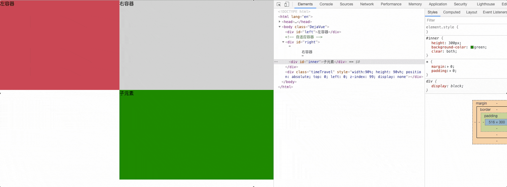
# 两列布局
两列布局一般情况下是指定宽与自适应布局,两列中左列是确定宽度,右列是自动填满剩余所有空间的一种布局效果。
- 左定宽,右自适应
- float + margin
- float + margin(fix)
- float + overflow 实现
- table + table-cell
- position
- flex
- grid
float + margin
缺点:右边元素里的inner 如果添加了 clear: both; 会使 inner 出现掉落问题。
<div id="left">左容器</div>
  <!-- 自适应容器 -->
<div id="right">
  右容器
  <div id="inner">子元素</div>
</div>
2
3
4
5
6
*{ margin: 0;padding: 0;}

#left {
  width: 400px;/* 定宽 */
  height: 300px;
  background-color: #c9394a;
  float: left; /* 😸 😸 */
}

#right {
  height: 400px;
  background-color: #cccccc;
  margin-left: 400px; /* 和左边容器宽度一致 */
}

#inner {
  height: 300px;
  background-color: green;
  /* 清除浮动属性 此处有问题,子容器会掉下来*/
  clear: both;
}
2
3
4
5
6
7
8
9
10
11
12
13
14
15
16
17
18
19
20
21
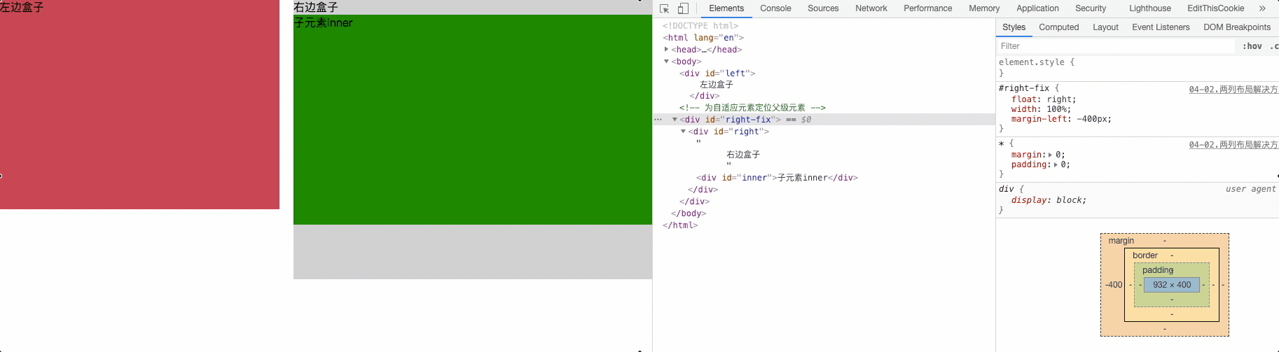
float + margin(fix)
解决子元素添加清浮动后掉下的问题
<div id="left">
  左边盒子
</div>
<!-- 为自适应元素定位父级元素 -->
<div id="right-fix">
  <div id="right">
    右边盒子
    <div id="inner">子元素inner</div>
  </div>
</div>
2
3
4
5
6
7
8
9
10
#left {
  width: 400px; /* 定宽 */
  height: 300px;
  background-color: #c9394a;
  float:left; /* 😸 😸 */
  /* 显示 - position  - 提高层级 - 防止被覆盖的问题 */
  position: relative; /* 😸 😸 */
}

#right-fix {
  /* 右边包裹盒子 浮动不定宽度同时往左移动 */
  float: right; /* 😸 😸 */
  width: 100%; /* 😸 😸 */
  margin-left: -400px; /* 😸 😸 */
}

#right {
  margin-left:420px;
  height: 400px;
  background-color: #cccccc;
}

#inner {
  background-color: green;
  height: 300px;
  clear: both;
}
2
3
4
5
6
7
8
9
10
11
12
13
14
15
16
17
18
19
20
21
22
23
24
25
26
27
float + overflow 实现 (利用BFC规则)
<div id="left"></div>
<div id="right"></div>
2
#left {
  width: 400px; /* 定宽 */
  height: 300px;
  background-color: #c9394a;
  float:left; /* 😸 😸 */
}

#right {
  height: 400px;
  background-color: #cccccc;
  /*
    BFC -  形成一个隔离容器 - 条件之一
    缺点:溢出隐藏
  */
  overflow: hidden; /* 😸 😸 */
}
2
3
4
5
6
7
8
9
10
11
12
13
14
15
16
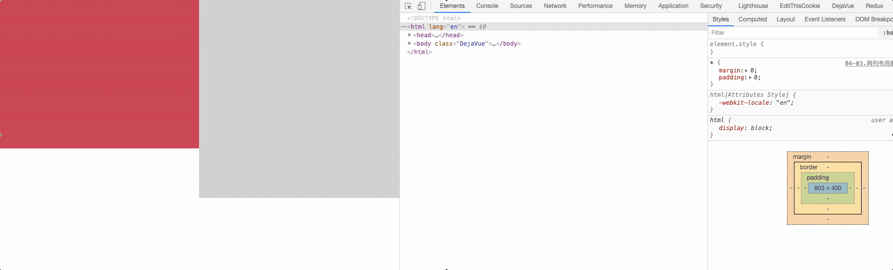
table + table-cell
<div id="parent">
  <div id="left"></div>
  <div id="right"></div>
</div>
2
3
4
#parent {
  width: 100%; /* 😸 😸 */
  height: 400px;
  /* table */
  display: table; /* 😸 😸 */
}

#left {
  /* td */
  display: table-cell; /* 😸 😸 */
  width: 400px;  /* 定宽 */ /* 😸 😸 */
  height: 300px;
  background-color: #c9394a;
}

#right {
  display: table-cell; /* 😸 😸 */
  height: 400px;
  background-color: #cccccc;
}
2
3
4
5
6
7
8
9
10
11
12
13
14
15
16
17
18
19
20
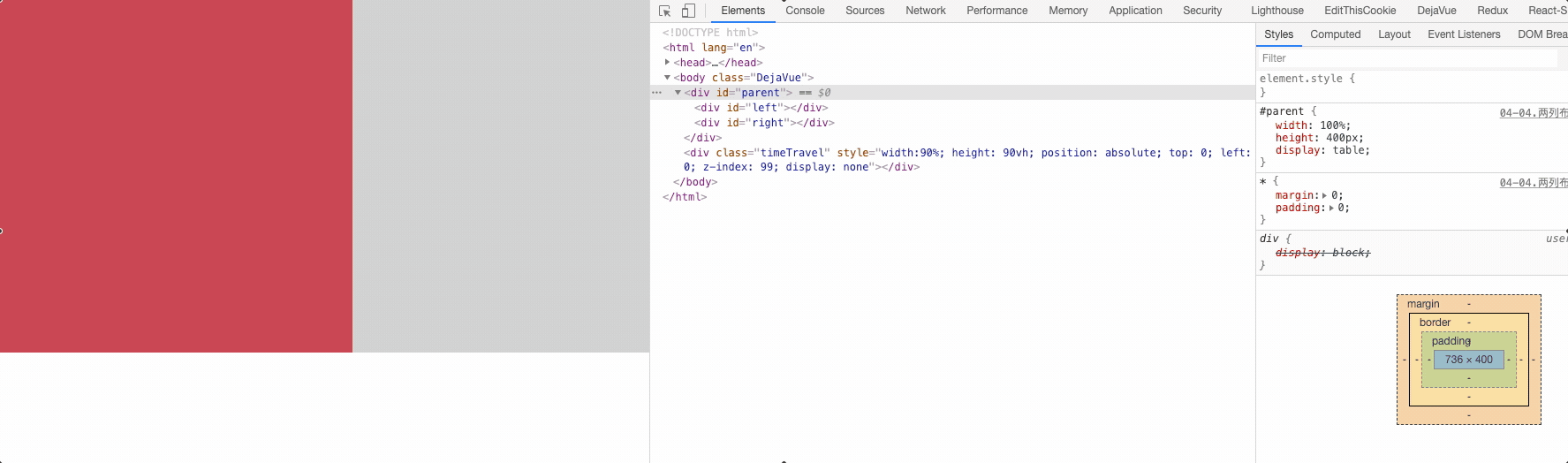
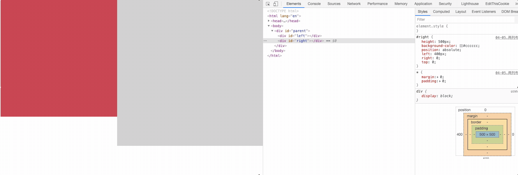
position
<div id="parent">
  <div id="left"></div>
  <div id="right"></div>
</div>
2
3
4
#parent{
  position: relative; /* 😸 😸 */
}
#left {
  width: 400px;  /* 定宽 */
  height: 400px;
  background-color: #c9394a;
  position: absolute; /* 😸 😸 */
  top: 0;
  left: 0;
}

#right {
  height: 500px;
  background-color: #cccccc;
  position: absolute; /* 😸 😸 */
  left: 400px;
  right: 0;
  top: 0;
}
2
3
4
5
6
7
8
9
10
11
12
13
14
15
16
17
18
19
20
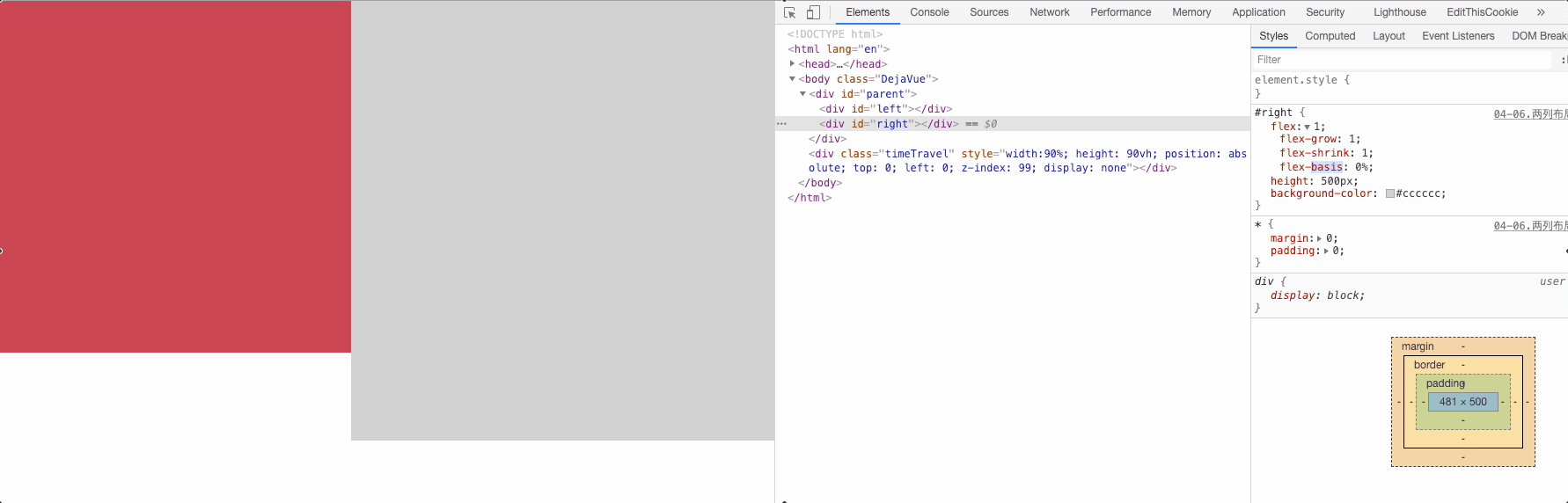
flex
<div id="parent">
  <div id="left"></div>
  <div id="right"></div>
</div>
2
3
4
#parent{
  width: 100%;
  height: 500px;
  /* 子元素 - 水平排列 */
  display: flex; /* 😸 😸 */
}

#left {
  width: 400px;  /* 定宽 */
  height: 400px;
  background-color: #c9394a;
}

#right {
  /* 100% - 400 */
  flex: 1; /* 😸 😸 */ /* flex: 0 1 auto 是 grow shrink basis的简写 */
  height: 500px;
  background-color: #cccccc;
}
2
3
4
5
6
7
8
9
10
11
12
13
14
15
16
17
18
19
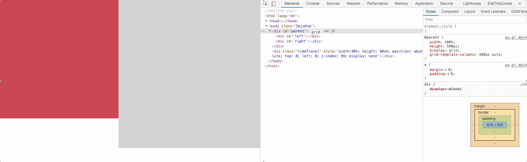
grid
<div id="parent">
  <div id="left"></div>
  <div id="right"></div>
</div>
2
3
4
#parent{
  width: 100%;
  height: 500px;
  /* 网格布局 */
  display: grid; /* 😸 😸 */
  /* 每个列的宽度  左 - 400px  右 - 自适应 */
  grid-template-columns: 400px auto;/* 😸 😸 */

}

#left {
  height: 400px;
  background-color: #c9394a;
}

#right {
  height: 500px;
  background-color: #cccccc;
}
2
3
4
5
6
7
8
9
10
11
12
13
14
15
16
17
18
19
20
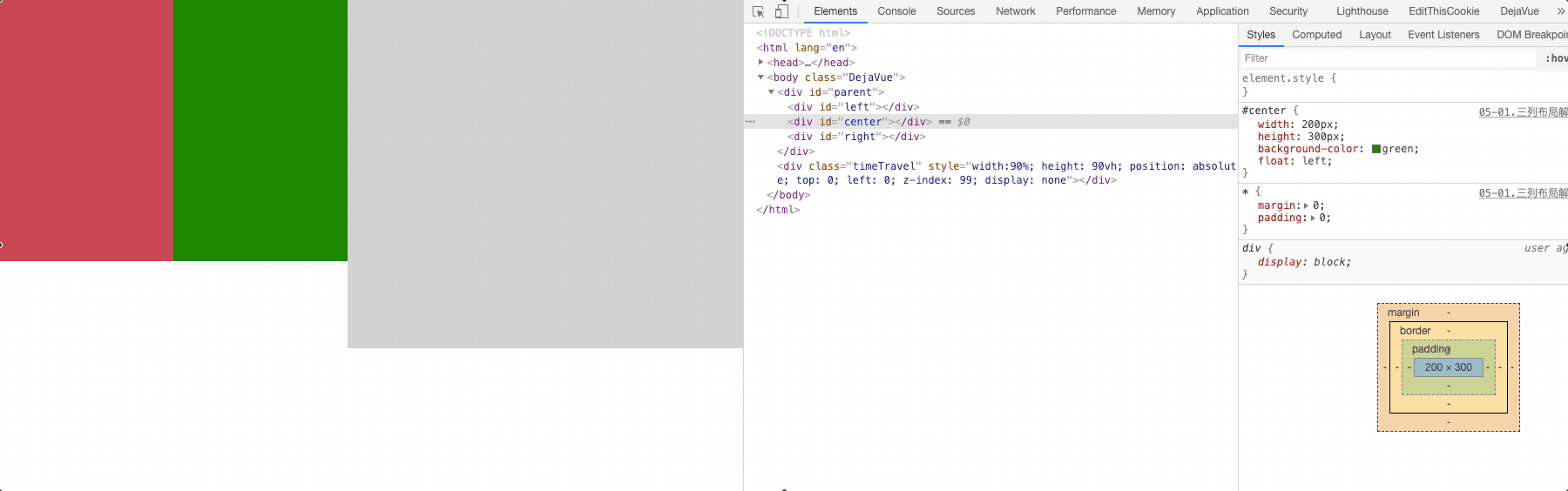
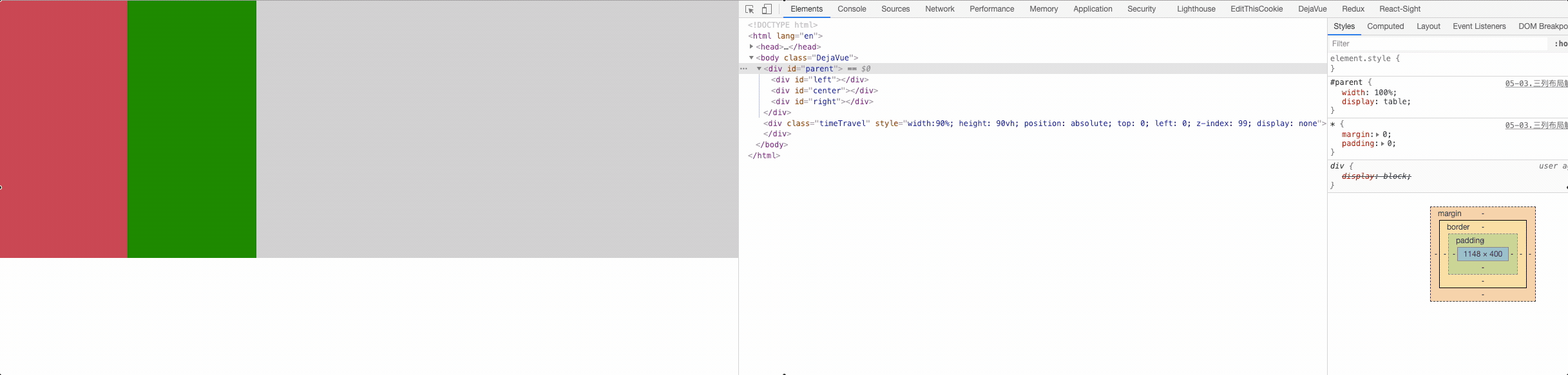
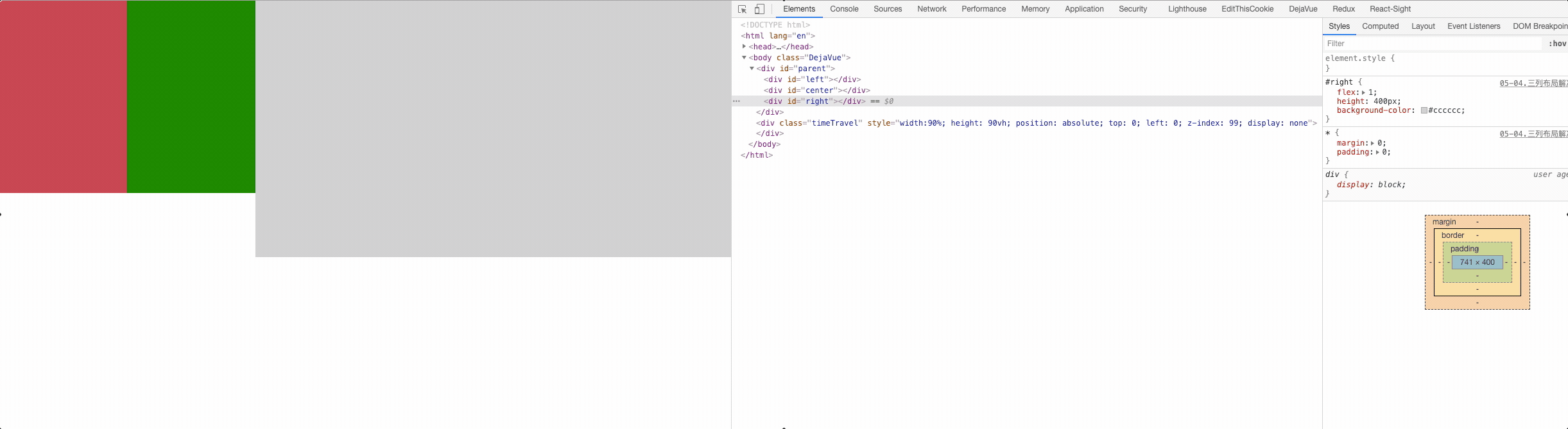
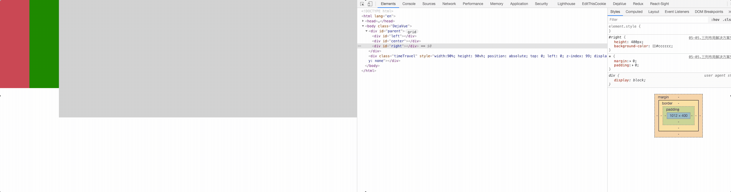
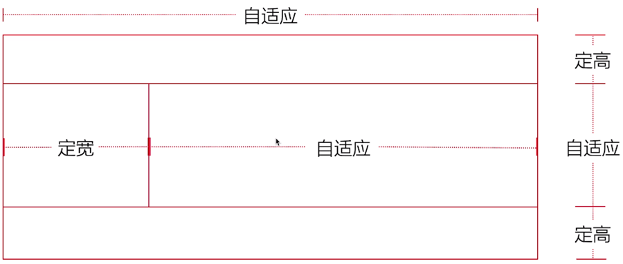
# 三列布局
三列布局一般情况下是指三列中左边两列是确定的宽度,右边一列是自动填满剩余所有空间的一种布局效果; 或者是 中间自适应,左边和右边定宽度。
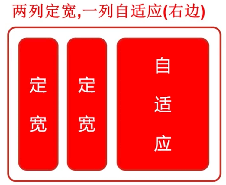
还是熟悉的配方,熟悉的味道 🐇 🐇

- float + margin
- float + overflow 实现
- table + table-cell
- flex
- grid
float + margin
<div id="parent">
  <div id="left"></div>
  <div id="center"></div>
  <div id="right"></div>
</div>
2
3
4
5
#left {
  width: 200px; /* 定宽 */
  height: 300px;
  background-color: #c9394a;
  float: left; /* 😸 😸 */
}

#center {
  width: 200px; /* 定宽 */
  height: 300px;
  background-color: green;
  float: left; /* 😸 😸 */
}

#right {
  height: 400px;
  background-color: #cccccc;
  margin-left: 400px; /* 😸 😸 */
}
2
3
4
5
6
7
8
9
10
11
12
13
14
15
16
17
18
19
float + overflow 实现
<div id="parent">
  <div id="left"></div>
  <div id="center"></div>
  <div id="right"></div>
</div>
2
3
4
5
#left {
  width: 200px; /* 定宽 */
  height: 300px;
  background-color: #c9394a;
  float: left;  /* 😸 😸 */
}

#center {
  width: 200px; /* 定宽 */
  height: 300px;
  background-color: green;
  float: left;  /* 😸 😸 */
}

#right {
  height: 400px;
  background-color: #cccccc;
  /* BFC - 条件之一 */
  overflow: hidden;  /* 😸 😸 */
}
2
3
4
5
6
7
8
9
10
11
12
13
14
15
16
17
18
19
20
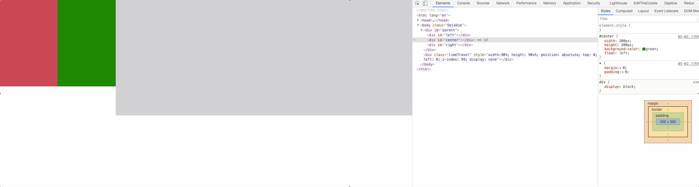
table + table-cell
<div id="parent">
  <div id="left"></div>
  <div id="center"></div>
  <div id="right"></div>
</div>
2
3
4
5
#parent{
  width: 100%;
  /* table 默认是等高布局的即使子元素设置的高度不一样*/
  display: table; /* 😸 😸 */
}

#left {
  width: 200px; /* 定宽 */
  height: 300px;
  background-color: #c9394a;
  /* td */
  display: table-cell; /* 😸 😸 */
}

#center {
  width: 200px; /* 定宽 */
  height: 300px;
  background-color: green;
  /* td */
  display: table-cell; /* 😸 😸 */
}

#right {
  height: 400px;
  background-color: #cccccc;
  /* td */
  display: table-cell; /* 😸 😸 */
}
2
3
4
5
6
7
8
9
10
11
12
13
14
15
16
17
18
19
20
21
22
23
24
25
26
27
28
flex
<div id="parent">
  <div id="left"></div>
  <div id="center"></div>
  <div id="right"></div>
</div>
2
3
4
5
#parent{
  height: 300px;
  /* 子元素的排列 - 水平排列 */
  display: flex; /* 😸 😸 */
}

#left {
  width: 200px; /* 定宽 */
  height: 300px;
  background-color: #c9394a;
}

#center {
  width: 200px; /* 定宽 */
  height: 300px;
  background-color: green;
}

#right {
  /* 100% - 200 - 200  */
  flex: 1; /* 😸 😸 */
  height: 400px;
  background-color: #cccccc;
}
2
3
4
5
6
7
8
9
10
11
12
13
14
15
16
17
18
19
20
21
22
23
24
grid
<div id="parent">
  <div id="left"></div>
  <div id="center"></div>
  <div id="right"></div>
</div>
2
3
4
5
#parent{
  height: 400px;
  display: grid; /* 😸 😸 */
  grid-template-columns: 100px 100px auto; /* 😸 😸 */
}
#left {
  height: 300px;
  background-color: #c9394a;
}

#center {
  height: 300px;
  background-color: green;
}

#right {
  height: 400px;
  background-color: #cccccc;
}
2
3
4
5
6
7
8
9
10
11
12
13
14
15
16
17
18
19
一般很常用的就是 两侧定宽,中间自适应,然鹅这里面最常问到的就是圣杯布局(据说形似杯子),双飞翼(据说像翅膀,可自由拆卸)
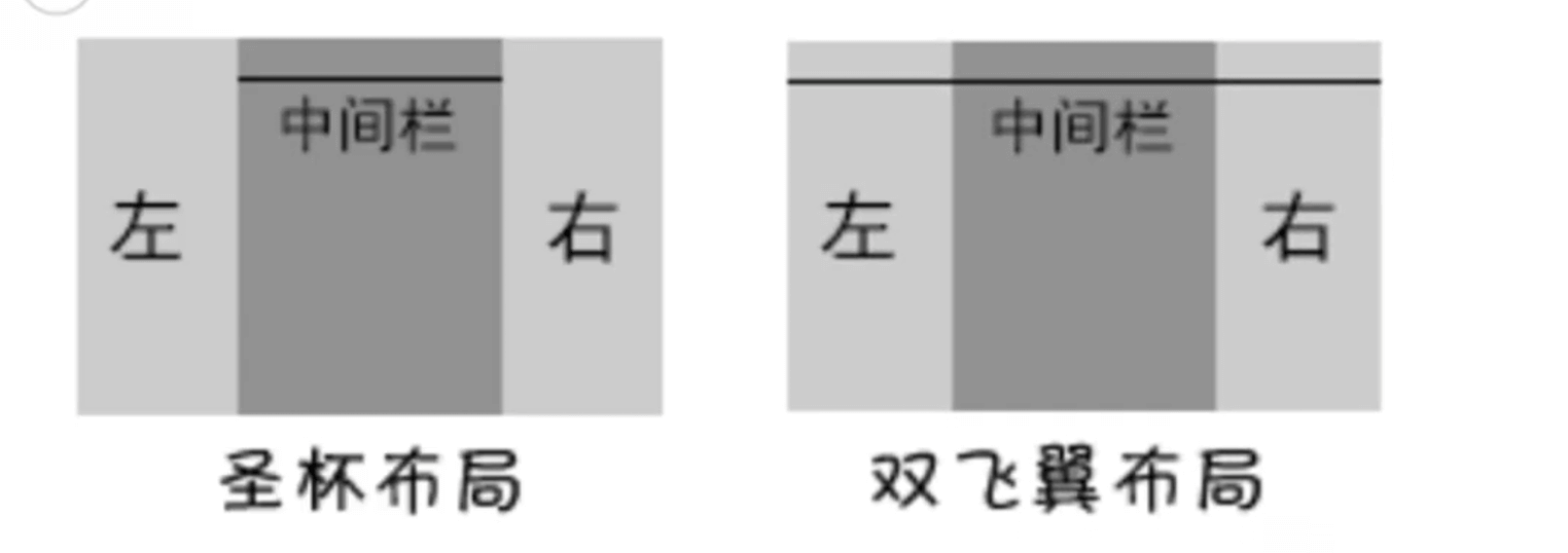
# 圣杯布局
圣杯布局是来源于该布局效果类似圣杯而得名。简单来说,就是指三行三列布局;
圣杯布局核心:主要是实现中间主体部分中的左右定宽+中间自适应的布局效果;
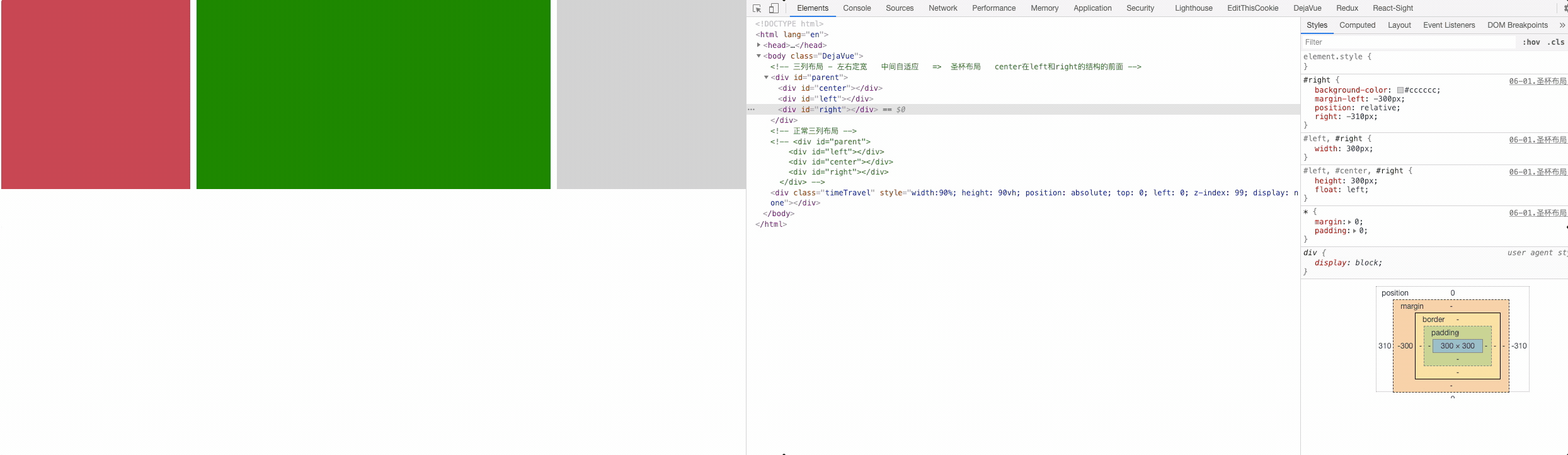
<!-- 三列布局 - 左右定宽 中间自适应 => 圣杯布局 center 在 left 和 right 的结构的前面 -->
<div id="parent">
  <div id="center"></div>
  <div id="left"></div>
  <div id="right"></div>
</div>
2
3
4
5
6
#parent {
  height: 300px;
  /* 第二步: 给left和right容器留出一些空间  把center往中间进行挤压 */
  padding-left: 310px;  /* 😸 😸 */
  padding-right: 310px;  /* 😸 😸 */
}

#left,
#center,
#right {
  height: 300px;
  /*
    第一步: 三个容器横向排列 float => center 100%
    left 和 right 因为没有剩余的空间 所以掉下去啦
  */
  float: left;  /* 😸 😸 */
}

#left,
#right {
  width: 300px; /* 定宽 */
}

#left {
  background-color: #c9394a;
  /* 第三步: 把left移到它原本位置 => left应该在center的前面 */
  /* margin-left: -100% 就是center的宽度 */
  margin-left: -100%;  /* 😸 😸 */
  /* 把left移动在理想的位置 => 定位 relative 作用是为了让left生效*/
  position: relative;  /* 😸 😸 */
  left: -310px;  /* 😸 😸 */
}

#center {
  width: 100%;
  background-color: green;
}

#right {
  background-color: #cccccc;
  /* 第四步: 把right移到它原本位置 => right应该在center的后面 */
  /* 右侧移动的宽度是自己的宽度 margin-left: -300px */
  margin-left: -300px;  /* 😸 😸 */
  position: relative;  /* 😸 😸 */
  right: -310px;  /* 😸 😸 */
}
2
3
4
5
6
7
8
9
10
11
12
13
14
15
16
17
18
19
20
21
22
23
24
25
26
27
28
29
30
31
32
33
34
35
36
37
38
39
40
41
42
43
44
45
46
47
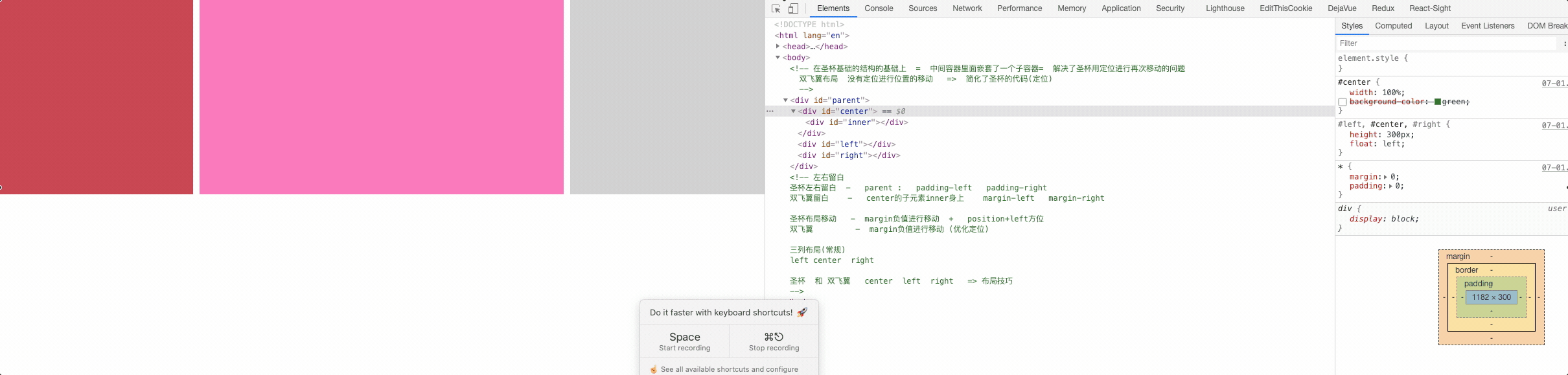
# 双飞翼布局
双飞翼布局最早是淘宝团队提出,是针对圣杯布局的优化解决方案。主要是优化了圣杯布局中开启定位的问题。
<!--
  在圣杯基础的结构的基础上 = 中间容器里面嵌套了一个子容器 =  解决了圣杯用定位进行再次移动的问题
  双飞翼布局 没有定位进行位置的移动 => 简化了圣杯的代码(定位)
-->
<div id="parent">
  <div id="center">
    <div id="inner"></div>
  </div>
  <div id="left"></div>
  <div id="right"></div>
</div>
2
3
4
5
6
7
8
9
10
11
#parent {
  height: 300px;
}

#left,
#center,
#right {
  height: 300px;
  /*
    第一步: 让三个列横向排列 => float 三个列其实是在一行显示
    我们看到的不在一行 => center 100%  放不下 挤下去了
  */
  float: left;  /* 😸 😸 */
}

#left,
#right {
  width: 300px;
}

#left {
  background-color: #c9394a;
  /* 第三步: 位置的移动 => 移动到她原本的位置*/
  margin-left: -100%;  /* 😸 😸 */
}

#center {
  width: 100%;
  /* background-color: green; */
}

#right {
  background-color: #cccccc;
  /* 位置的移动  => 移动到她原本的位置  */
  margin-left: -300px;  /* 😸 😸 */
}

#inner {
  height: 300px;
  background-color: hotpink;
  /* 第二步: 把center进行挤压  */
  /* 给left的容器 留出的空间 */
  margin-left: 310px;  /* 😸 😸 */
  /* 给right的容器 留出的空间 */
  margin-right: 310px;  /* 😸 😸 */
}
2
3
4
5
6
7
8
9
10
11
12
13
14
15
16
17
18
19
20
21
22
23
24
25
26
27
28
29
30
31
32
33
34
35
36
37
38
39
40
41
42
43
44
45
46
圣杯和双飞翼的对比
| 对比 | 圣杯 | 双飞翼 |
|---|---|---|
| 左右留白 | parent : padding-left padding-right | center 的子元素 inner 身上 margin-left margin-right |
| 移动方式 | margin 负值进行移动 + position+left 方位 | margin 负值进行移动 (没有定位) |
| 布局方式 | center left right | center left right |
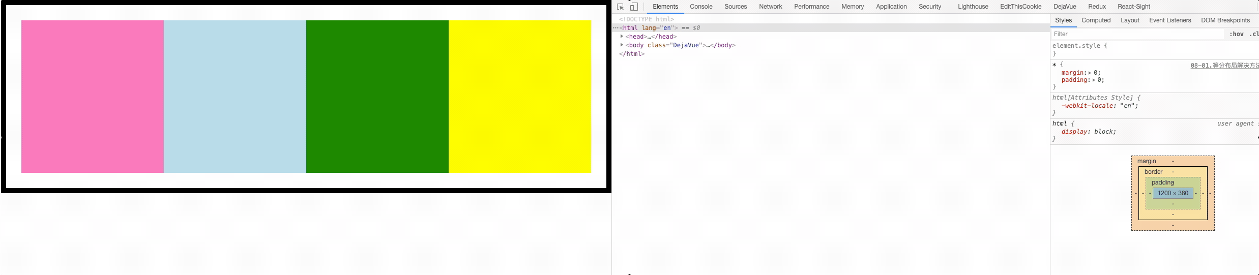
# 等分布局
等分布局就是指一行被分为若干列,每一列的宽度是相同的值

实现方式:
- float 属性实现等分布局效果;
- display 属性的值有关table实现等分布局效果;
- flex 属性实现等分布局效果;
- Grid 属性实现等分布局效果;
float 属性实现等分布局效果;
<div id="parent" class="clearfix">
  <div class="col1"></div>
  <div class="col2"></div>
  <div class="col3"></div>
  <div class="col4"></div>
</div>
2
3
4
5
6
.clearfix::after {
  content: '';
  display: block;
  clear: both;
}
#parent {
  border: 10px solid #000;
  padding: 30px;
  /*
    子元素浮动  -  导致父元素的高度塌陷
    解决 1.固定的高度 height 固定写死
        2.overflow:hidden => BFC 特点: 把浮动的高度给计算进去
        3.clear:both 清除浮动 => 加在浮动子元素的末尾 <div style="clear:both"></div>
        4.利用伪元素::after => clearfix 公用类名 = 直接在html中进行调用 (最常用)
  */
}
.col1,
.col2,
.col3,
.col4 {
  height: 300px;
  /* 等分 (4分) =  float  100%/4 */
  float: left; /* 😸 😸 */
  width: 25%; /* 😸 😸 */
}

.col1 {
  background-color: hotpink;
}

.col2 {
  background-color: lightblue;
}

.col3 {
  background-color: green;
}

.col4 {
  background-color: yellow;
}
2
3
4
5
6
7
8
9
10
11
12
13
14
15
16
17
18
19
20
21
22
23
24
25
26
27
28
29
30
31
32
33
34
35
36
37
38
39
40
41
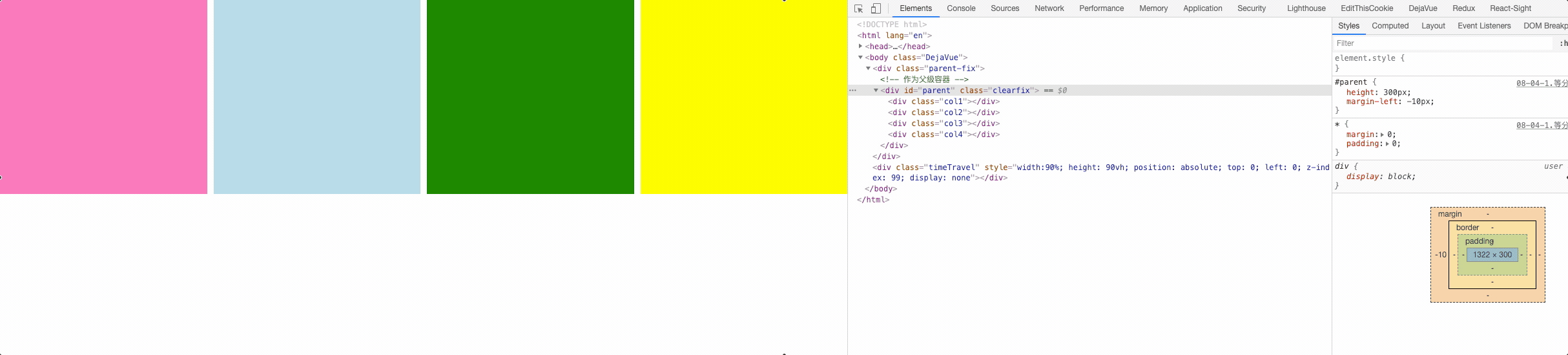
浮动等分布局有间距情况:
使用 border 作为间距,同时给父盒子添加 margin 负值
#parent {
  height: 300px;
  /* 整体往左边进行移动  - 间距隐藏起来 */
  margin-left: -10px; /* 😸 😸 */
}

.col1,
.col2,
.col3,
.col4 {
  height: 300px;
  width: 25%;
  float: left;
  border-left: 10px solid #fff; /* 😸 😸 */
  /* 怪异盒模型   */
  box-sizing: border-box; /* 😸 😸 */
  /*
    盒子模型
    box-sizing:
    content-box(正常盒模型): width宽度 = 内容的宽度
    border-box(怪异盒模型):  width宽度 = border + padding + 内容宽度
    margin 不影响盒子模型的大小 => 间距或者位置移动
  */
}

/* 问题: 第一个容器的面积比其他三个容器大小是要大一些  */
/*
  .col1:first-child{
    border: 0;
  }
*/

.col1{
  background-color: hotpink;
}

.col2{
  background-color: lightblue;
}

.col3{
  background-color: green;
}

.col4{
  background-color: yellow;
}
2
3
4
5
6
7
8
9
10
11
12
13
14
15
16
17
18
19
20
21
22
23
24
25
26
27
28
29
30
31
32
33
34
35
36
37
38
39
40
41
42
43
44
45
46
47
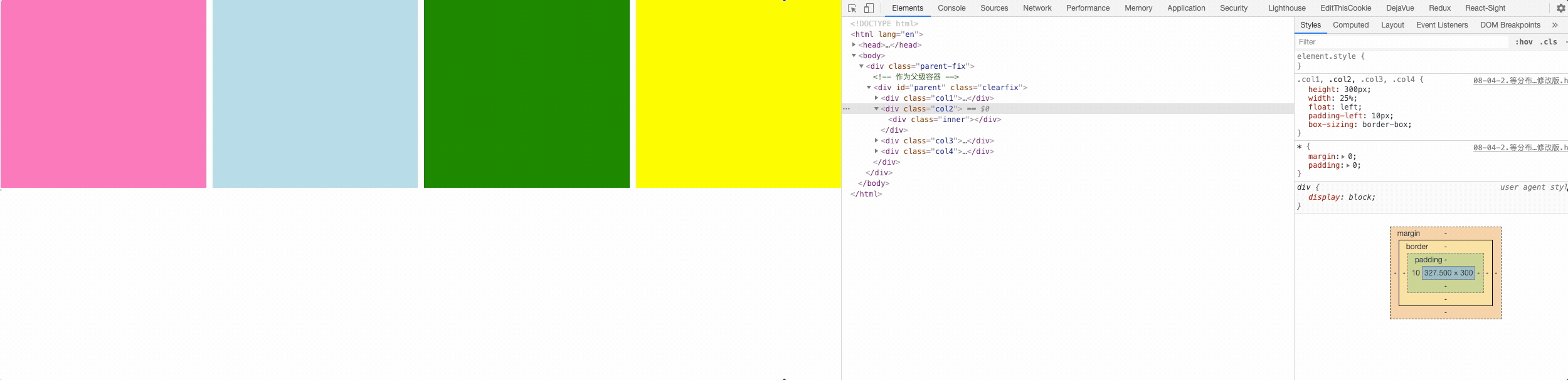
使用内填充 padding 实现间距,需要给子元素在加一个盒子。
<div class="parent-fix">
  <!-- 作为父级容器 -->
  <div id="parent" class="clearfix">
    <div class="col1">
      <div class="inner"></div>
    </div>
    <div class="col2">
      <div class="inner"></div>
    </div>
    <div class="col3">
      <div class="inner"></div>
    </div>
    <div class="col4">
      <div class="inner"></div>
    </div>
  </div>
</div>
2
3
4
5
6
7
8
9
10
11
12
13
14
15
16
17
.parent-fix {
  overflow: hidden;
}

#parent {
  height: 300px;
  margin-left: -10px; /* 😸 😸 */
}

.col1,
.col2,
.col3,
.col4 {
  height: 300px;
  width: 25%;
  float: left;
  padding-left: 10px; /* 😸 😸 */
  /*
    padding 已经计算在了25%
    padding 是内容的一个部分
  */
  box-sizing: border-box;
}

.col1 .inner{
  height: 300px;
  background-color: hotpink;
}

.col2 .inner{
  height: 300px;
  background-color: lightblue;
}

.col3 .inner{
  height: 300px;
  background-color: green;
}

.col4 .inner{
  height: 300px;
  background-color: yellow;
}
2
3
4
5
6
7
8
9
10
11
12
13
14
15
16
17
18
19
20
21
22
23
24
25
26
27
28
29
30
31
32
33
34
35
36
37
38
39
40
41
42
43
display 属性的值有关table实现等分布局效果
<div id="parent">
  <div class="col1"></div>
  <div class="col2"></div>
  <div class="col3"></div>
  <div class="col4"></div>
</div>
2
3
4
5
6
#parent {
  width: 100%;
  /* table */
  display: table; /* 😸 😸 */
}

.col1,
.col2,
.col3,
.col4 {
  /* td */
  display: table-cell; /* 😸 😸 */
  height: 300px;
}

.col1 {
  background-color: hotpink;
}

.col2 {
  background-color: lightblue;
}

.col3 {
  background-color: green;
}

.col4 {
  background-color: yellow;
}
2
3
4
5
6
7
8
9
10
11
12
13
14
15
16
17
18
19
20
21
22
23
24
25
26
27
28
29
30
table 等分布局有间距情况:不要给某一个元素单独做处理否则就不是等分了。
<!-- 作为父级容器 -->
<div id="parent-wrap">
  <div id="parent">
    <div class="col1">
      <div class="inner"></div>
    </div>
    <div class="col2">
      <div class="inner"></div>
    </div>
    <div class="col3">
      <div class="inner"></div>
    </div>
    <div class="col4">
      <div class="inner"></div>
    </div>
  </div>
</div>
2
3
4
5
6
7
8
9
10
11
12
13
14
15
16
17
#parent-wrap{
  /* 反向移动 */
  margin-left: -10px; /* 😸 😸 */
}
#parent {
  width: 100%;
  /* table */
  display: table;
}

.col1,
.col2,
.col3,
.col4 {
  /* td */
  display: table-cell; /* 😸 😸 */
  height: 300px;

  padding-left:10px; /* 😸 😸 */
  /* 内部计算  padding-left 计算进去 */
}

.col1 .inner{
  height: 300px;
  background-color: hotpink;
}

.col2 .inner{
  height: 300px;
  background-color: lightblue;
}

.col3 .inner{
  height: 300px;
  background-color: green;
}

.col4 .inner{
  height: 300px;
  background-color: yellow;

}
/*
  问题:第一个模块直接消失
  table   td
*/
/*
  .col1 {
    padding-left: 0;
  }
*/
2
3
4
5
6
7
8
9
10
11
12
13
14
15
16
17
18
19
20
21
22
23
24
25
26
27
28
29
30
31
32
33
34
35
36
37
38
39
40
41
42
43
44
45
46
47
48
49
50
51
flex 属性实现等分布局效果
<div id="parent">
  <div class="col1"></div>
  <div class="col2"></div>
  <div class="col3"></div>
  <div class="col4"></div>
</div>
2
3
4
5
6
#parent {
  width: 100%;
  /* 子元素排列 = 水平排列 */
  display: flex;  /* 😸 😸 */
}

.col1,
.col2,
.col3,
.col4 {
  height: 300px;
  /* 四个容器 占1等份 1/4 = 100%/ 4 */
  flex: 1;  /* 😸 😸 */
}

.col1 {
  background-color: hotpink;
}

.col2 {
  background-color: lightblue;
}

.col3 {
  background-color: green;
}

.col4 {
  background-color: yellow;
}
2
3
4
5
6
7
8
9
10
11
12
13
14
15
16
17
18
19
20
21
22
23
24
25
26
27
28
29
30
flex 等分布局间距情况
<!-- 作为父级容器 -->
<div id="parent">
  <div class="col1">
    <div class="inner"></div>
  </div>
  <div class="col2">
    <div class="inner"></div>
  </div>
  <div class="col3">
    <div class="inner"></div>
  </div>
  <div class="col4">
    <div class="inner"></div>
  </div>
</div>
2
3
4
5
6
7
8
9
10
11
12
13
14
15
#parent {
  /* 子元素排列  =  水平排列 */
  display: flex;  /* 😸 😸 */
  margin-left: -10px;  /* 😸 😸 */
}

.col1,
.col2,
.col3,
.col4 {
  height: 300px;
  /* 四个容器  占1等份  1/4  = 100%/ 4 */
  flex: 1;  /* 😸 😸 */
  padding-left: 10px;  /* 😸 😸 */
}

.col1 .inner{
  height: 300px;
  background-color: hotpink;
}

.col2 .inner{
  height: 300px;
  background-color: lightblue;
}

.col3 .inner{
  height: 300px;
  background-color: green;
}

.col4 .inner{
  height: 300px;
  background-color: yellow;
}
2
3
4
5
6
7
8
9
10
11
12
13
14
15
16
17
18
19
20
21
22
23
24
25
26
27
28
29
30
31
32
33
34
35
# 等高布局
等分布局就是指一行被分为若干列,每一列的宽度是相同的值;
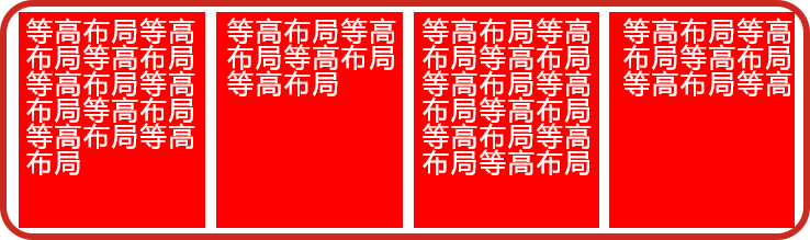
- table 实现
- padding-bottom: 9999px; margin-bottom: -9999px; 伪等高
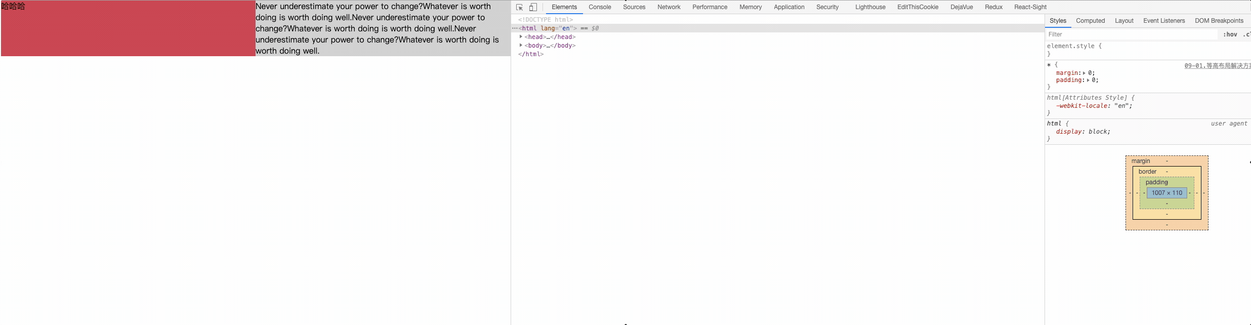
table 实现:
<div id="parent">
  <div id="left">哈哈哈</div>
  <div id="right">Never underestimate your power to change?Whatever is
   worth doing is worth doing well.Never underestimate your power to
   change?Whatever is worth doing is worth doing well.Never underestimate
   your power to change?Whatever is worth doing is worth doing well.</div>
</div>
2
3
4
5
6
7
#parent {
  width: 100%;
  /* table */
  display: table; /* 😸 😸 */
}

#left,
#right {
  width: 300px;
  /* td */
  display: table-cell; /* 😸 😸 */
}

#left {
  background-color: #c9394a;
}

#right {
  background-color: #cccccc;
}
2
3
4
5
6
7
8
9
10
11
12
13
14
15
16
17
18
19
20
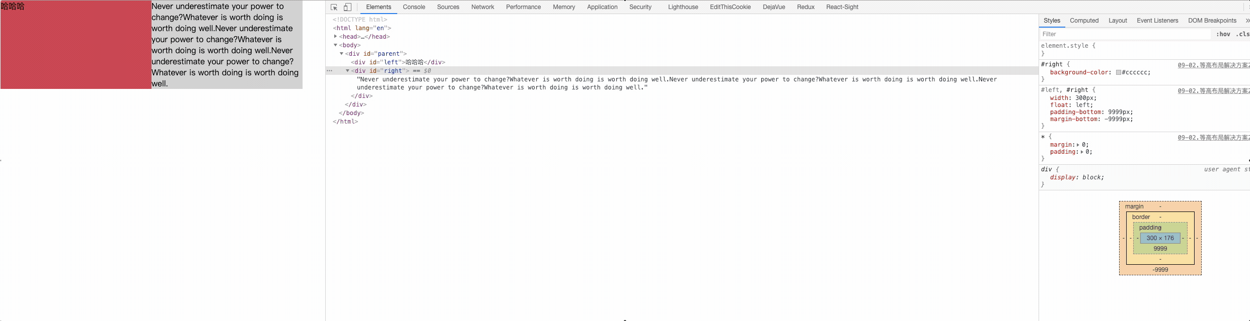
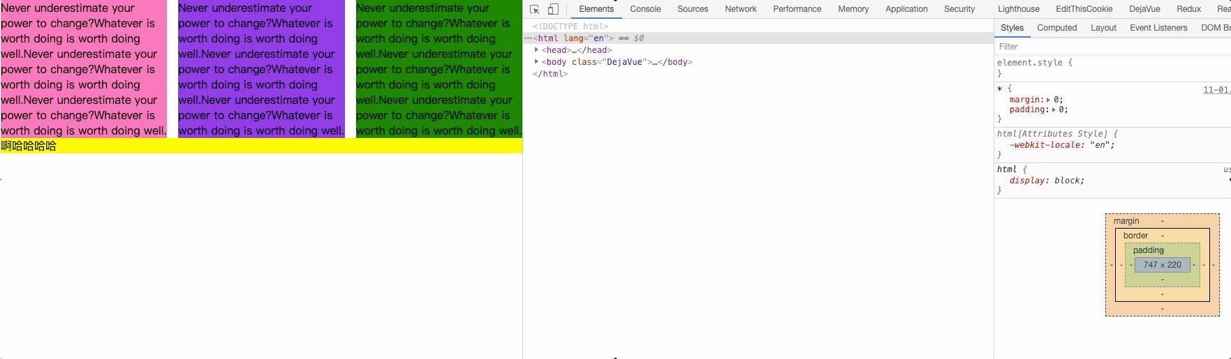
伪等高方式:
<div id="parent">
  <div id="left">哈哈哈</div>
  <div id="right">Never underestimate your power to change?Whatever is
   worth doing is worth doing well.Never underestimate your power to
   change?Whatever is worth doing is worth doing well.Never underestimate
   your power to change?Whatever is worth doing is worth doing well.</div>
</div>
2
3
4
5
6
7
/* 伪等高布局 */
#parent {
  width: 100%;
  /* 溢出隐藏 */
  overflow: hidden; /* 😸 😸 */
}

#left,
#right {
  width: 300px;
  float: left; /* 😸 😸 */

  /* 内填充 足够大 9999px */
  padding-bottom: 9999px; /* 😸 😸 */

  /* 外间距  */
  margin-bottom: -9999px; /* 😸 😸 */
}

#left {
  background-color: #c9394a;
}

#right {
  background-color: #cccccc;
}
2
3
4
5
6
7
8
9
10
11
12
13
14
15
16
17
18
19
20
21
22
23
24
25
26
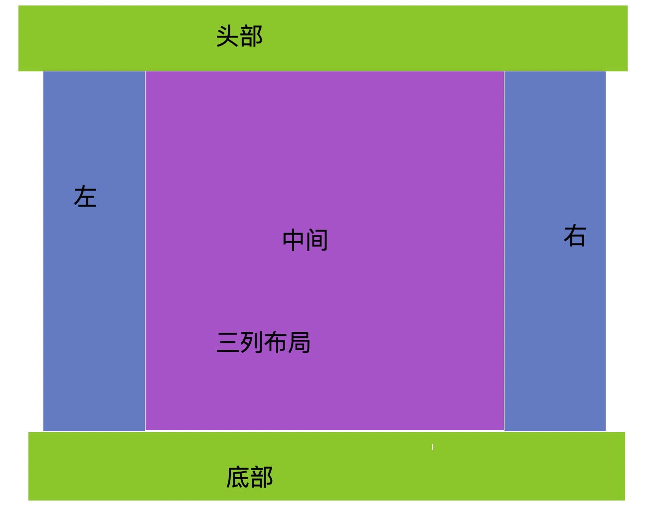
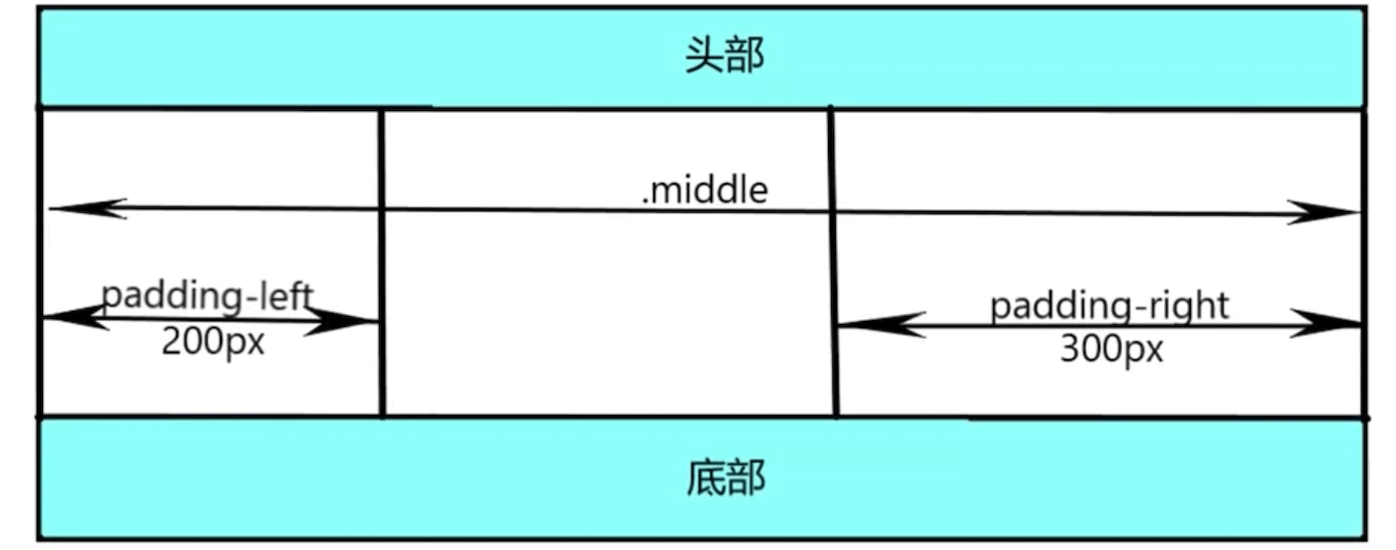
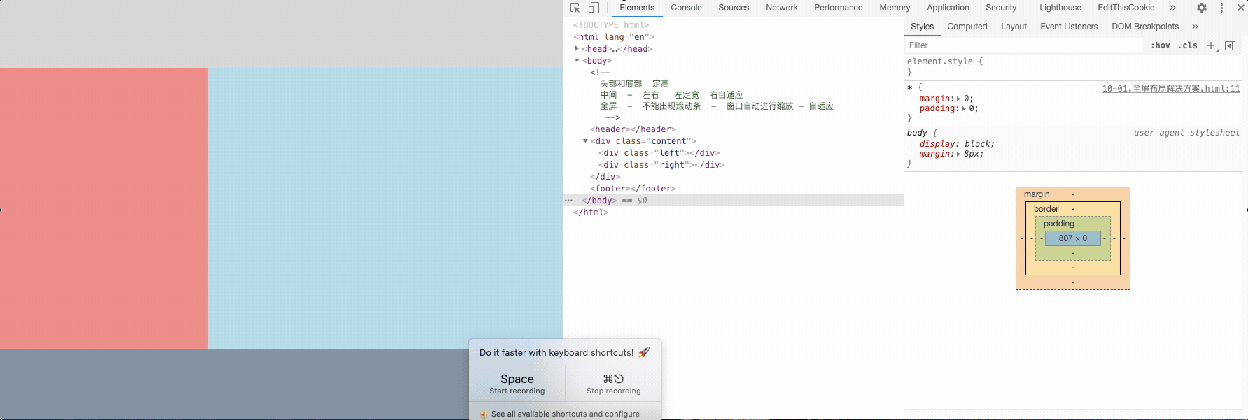
# 全屏布局
全屏布局就是指HTML页面铺满整个浏览器窗口,并且没有滚动条。而且还可以跟着浏览器的大小变化而变化;
<!--
  头部和底部  定高
  中间  -  左右 左定宽 右自适应
  全屏  - 不能出现滚动条 - 窗口自动进行缩放 - 自适应
-->
<header></header>
<div class="content">
  <div class="left"></div>
  <div class="right"></div>
</div>
<footer></footer>
2
3
4
5
6
7
8
9
10
11
header {
  height: 100px;
  background-color: lightgray;
  /* 固定在头部 - 定位元素的宽度是元素本身内容的宽度 */
  position: fixed; /* 😸 😸 */
  top: 0; /* 😸 😸 */
  /* 宽度撑开 - width:100% */
  left: 0; /* 😸 😸 */
  right: 0; /* 😸 😸 */
}

.content {
  background-color: lightblue;
  /* 高度撑开 */
  position: fixed; /* 😸 😸 */
  top: 100px;  /* 😸 😸 */
  bottom: 100px; /* 😸 😸 */
  /* 宽度撑开 */
  left: 0;
  right: 0;
  /* 隐藏滚动条 - auto overflow-x  overflow-y */
}

.content .left {
  width: 300px;
  height: 100%;
  background-color: lightcoral;
  /* 定宽 300 */
  position: fixed; /* 😸 😸 */
  top: 100px; /* 😸 😸 */
  bottom: 100px; /* 😸 😸 */
  left: 0; /* 😸 😸 */
}

.content .right {
  background-color: greenyellow;
  /* height:10000px; */

  /* 自适应  */
  position: fixed; /* 😸 😸 */
  /* 宽度撑开 */
  left: 300px; /* 😸 😸 */
  right: 0; /* 😸 😸 */
  /* 高度撑开 */
  top: 100px; /* 😸 😸 */
  /*bottom:100px; */
}

footer {
  height: 100px;
  background-color: lightslategray;
  /* 固定底部 */
  position: fixed; /* 😸 😸 */
  bottom: 0; /* 😸 😸 */
  left: 0; /* 😸 😸 */
  right: 0; /* 😸 😸 */
}
2
3
4
5
6
7
8
9
10
11
12
13
14
15
16
17
18
19
20
21
22
23
24
25
26
27
28
29
30
31
32
33
34
35
36
37
38
39
40
41
42
43
44
45
46
47
48
49
50
51
52
53
54
55
56
57
注意:这个栗子是使用的定位骚操作 😒
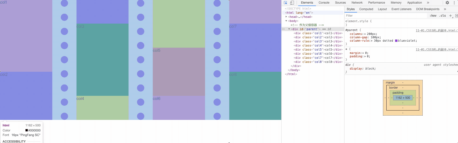
# CSS3 多列布局 (瀑布流布局)
columns: 他是 column-width 和 column-count 属性的缩写;
- column-width 表示每一栏/列的最佳宽度, 如果我们只设定 column-width,浏览器会自动根据现有容器宽度划分栏目的个数;
- column-count 表示理想的分栏数目;
- column-rule-color 表示每个栏目中间分隔线的颜色;
- column-rule-style 表示每个栏目中间分隔线的类型。支持的属性值和 border-style 是一模一样的;
- column-rule-width 表示每个栏目中间分隔线的宽度大小。支持的属性值和 border-width 是一模一样的;
- column-rule: column-rule 是 column-rule-width,column-rule-style 和 column-rule-color 这3个CSS属性的缩写。正如 border 是border-style,border-width 和 border-color 的缩写一样;
- column-span 有点类似于表格布局中的 colspan 这个HTML属性,表示某一个内容是否跨多栏显示;
- column-fill 作用是当内容分栏的时候,如何平衡每一栏填充的内容;
- column-gap 表示每一栏之间的那个空白间隙大小;
<!-- 作为父级容器 -->
<div id="parent">
  <div class="col1">col1</div>
  <div class="col2">col2</div>
  <div class="col3">col3</div>
  <div class="col4">col4</div>
  <div class="col5">col5</div>
  <div class="col6">col6</div>
  <div class="col7">col7</div>
  <div class="col8">col8</div>
</div>
2
3
4
5
6
7
8
9
10
11
/* 第一个父容器 - 4个容器 */
#parent {
  /*
    columns: 列宽 列数量; 100% / 200 = 有个多少列
    columns-width: 列宽
    columns-count: 列数  100% / 5 = 每个列的宽度
    column-gap: 列间距

    border: 边框线
    border-width
    border-style
    border-color
  */
  /* 列宽 */
  columns: 200px;
  /* 列间距 */
  column-gap: 100px;
  /*
  边框线属性
  column-rule-width: 30px;
  column-rule-style:dotted;
  column-rule-color: blueviolet;
  */
  /* 简写 */
  column-rule: 30px dotted blueviolet;
}
.col1,
.col2,
.col3,
.col4{
  height: 300px;
}
.col5,
.col6,
.col7,
.col8{
  height: 200px;
}

.col1,
.col6 {
  background-color: hotpink;
}

.col2,
.col7 {
  background-color: blueviolet;
}

.col3,.col8 {
  background-color: green;
}

.col4,
.col9 {
  background-color: yellow;
}

.col5 {
  background-color: tomato;

}
2
3
4
5
6
7
8
9
10
11
12
13
14
15
16
17
18
19
20
21
22
23
24
25
26
27
28
29
30
31
32
33
34
35
36
37
38
39
40
41
42
43
44
45
46
47
48
49
50
51
52
53
54
55
56
57
58
59
60
61
62
<div id="parent3">
  <div class="col6">Never underestimate your power to change?Whatever
  is worth doing is worth doing well.Never underestimate your power
  to change?Whatever is worth doing is worth doing well.Never
  underestimate your power to change?Whatever
  is worth doing is worth doing well.</div>
  <div class="col7">Never underestimate your power to change?Whatever
  is worth doing is worth doing well.Never underestimate your power
  to change?Whatever is worth doing is worth doing well.Never
  underestimate your power to change?Whatever
  is worth doing is worth doing well
  </div>
  <div class="col8">Never underestimate your power to change?Whatever
  is worth doing is worth doing well.Never underestimate your power
  to change?Whatever is worth doing is worth doing well.Never
  underestimate your power to change?Whatever
  is worth doing is worth doing well</div>
  <div class="col9">啊哈哈哈哈</div>
</div>
2
3
4
5
6
7
8
9
10
11
12
13
14
15
16
17
18
19
#parent3 {
  /* columns-width: 200px; */
  /* columns-count: 3; */
  columns: 200px 3;
  /* td colspan 合并列 把多个列td 合并成一个td */
}

.col6 {
  background-color: hotpink;
}

.col7 {
  background-color: blueviolet;
}

.col8 {
  background-color: green;
}

.col9 {
  background-color: yellow;
}

.col9 {
  /*
    加到列的身上  td colspan => column-span: all 跨多个列 - 3个 = 全屏效果
  */
  column-span: all;
}
2
3
4
5
6
7
8
9
10
11
12
13
14
15
16
17
18
19
20
21
22
23
24
25
26
27
28
29
# 布局常见面试题
- 已知宽高实现盒子水平垂直居中
- 宽高不定实现盒子水平垂直居中
- 实现两栏(三栏)布局的方法
- 两列布局(三列布局)
- 块元素(div)水平垂直居中,文字内容在div中始终水平垂直居中
- 让元素垂直左右居中的方法,越多越好(包含flex)
- 实现页面的三栏布局,左右均为定宽,高度可以自适应
- 经典布局方案:圣杯,双飞翼
- 参考