# CSS 动画

# 动画细节和原理深入解析
动画的原理:
- 视觉暂留作用
- 画面逐渐变化
动画的类型:
- transition补间动画
- 位置 - 平移(left/right/margin/transform:translate)
- 方位 - 旋转(transform:rotate)
- 大小 - 缩放(transform:scale)
- 透明度(opacity)
- 其他 - 线性变换(transform)
- keyframes关键帧动画
- 相当于多个补间动画
- 与元素状态的变化无关
- 定义更加灵活
- 逐帧动画
- 适用于无法补间计算的动画
- 资源较大
- 使用steps()
# transform(形变)
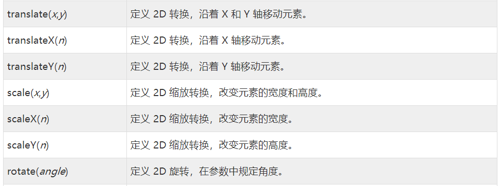
translate位移
- translate(): 指定对象的 2D translation(2D平移)。第一个参数对应X轴,第二个参数对应Y轴。如果第二个参数未提供,则默认值为0
- translateX(): 定对象X轴(水平方向)的平移
- translateY():指定对象Y轴(垂直方向)的平移
<div class="box"></div>
.box {
  width: 300px;
  height: 300px;
  background: #fff;
  box-shadow: 0 3px 4px rgba(0,0,0,.5);
  /* 过渡动画  translateY 0px = -25px */
  transition: all 1s ease;
}
.box:hover {
  /* 向上移动 */
  transform: translateY(-25px);
}
2
3
4
5
6
7
8
9
10
11
12
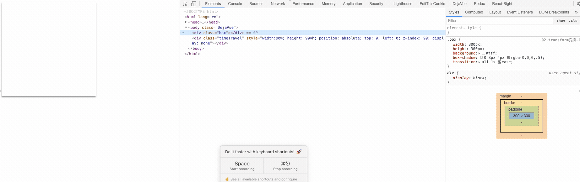
rotate旋转
- rotate(): 指定对象的2D rotation(2D旋转),需先有
transform-origin属性的定义;表示旋转一定的角度- rotate() = rotate(angle)
- rotate3d() = rotate3d(number, number, number, angle)
- rotateX() = rotateX(angle)
- rotateY() = rotateY(angle)
- rotateZ() = rotateZ(angle)
<div class="box1"></div>
/* 旋转 */
.box1 {
  width: 200px;
  height: 200px;
  background-color: rebeccapurple;
    transition: all 1s ease;
}
.box1:hover {
  transform: rotate(45deg);
}
2
3
4
5
6
7
8
9
10
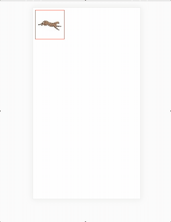
scale缩放
- scale():指定对象的2D scale(2D缩放)。第一个参数对应X轴,第二个参数对应Y轴。如果第二个参数未提供,则默认取第一个参数的值
- scaleX():指定对象X轴的(水平方向)缩放
- scaleY():指定对象Y轴的(垂直方向)缩放
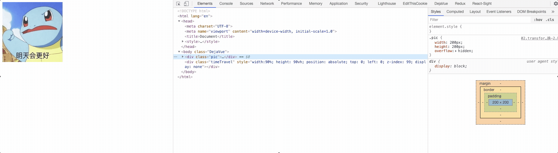
<div class="pic">
  <img src="./images/WechatIMG2388.jpeg" alt="">
</div>
2
3
/* 缩放 */
.pic {
  width: 200px;
  height: 200px;
  overflow: hidden;
}
.pic img {
  width: 200px;
  height: 200px;
  /* 元素默认属性的身上- 鼠标移入移出都有一个动画的效果 */
  transition: all 1s ease;
}
.pic:hover img {
  transform: scale(1.5);

}
2
3
4
5
6
7
8
9
10
11
12
13
14
15
16
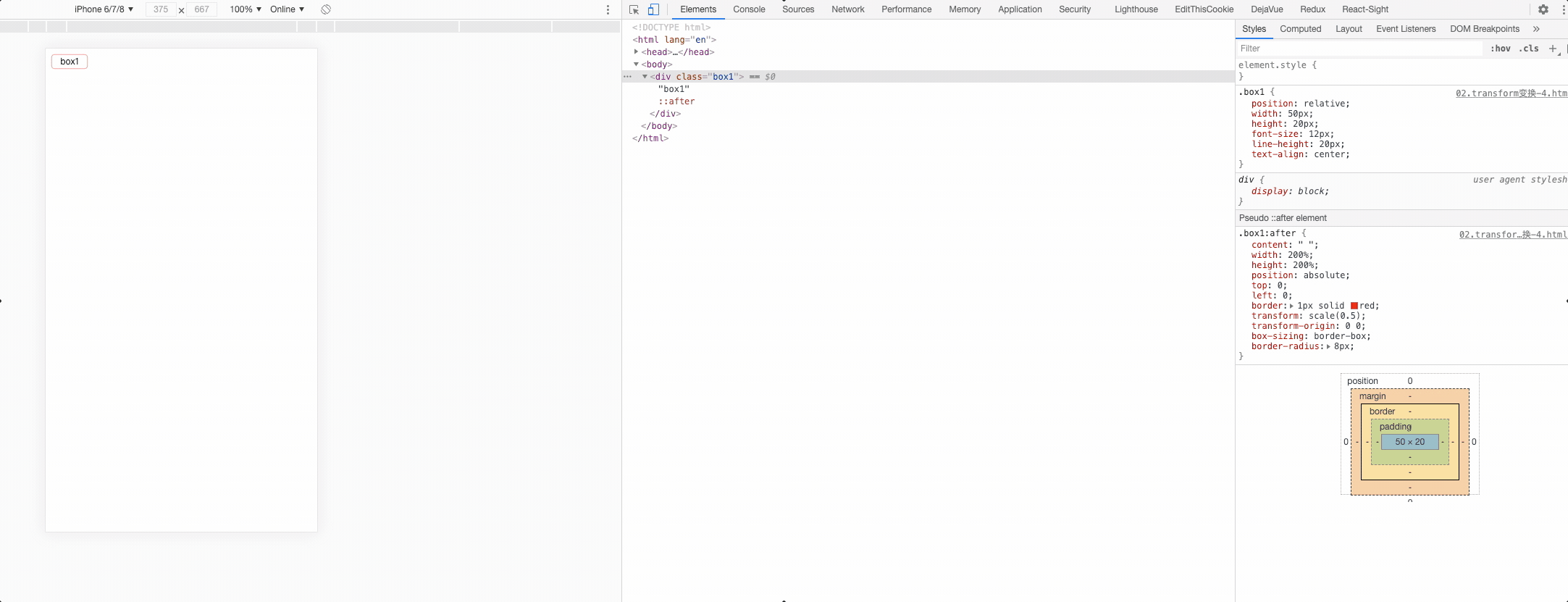
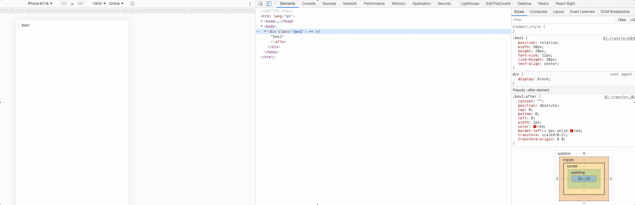
# 使用缩放实现移动端 1px
4边框
<div class="box1">box1</div>
.box1 {
  position: relative;
  width: 50px;
  height: 20px;
  font-size: 12px;
  line-height: 20px;
  text-align: center;
}
.box1:after {
  content: " ";
  width: 200%;
  height: 200%;
  position: absolute;
  top: 0;
  left: 0;
  border: 1px solid red;
  transform: scale(0.5);
  transform-origin: 0 0;
  box-sizing: border-box;
  border-radius: 8px;
}
2
3
4
5
6
7
8
9
10
11
12
13
14
15
16
17
18
19
20
21
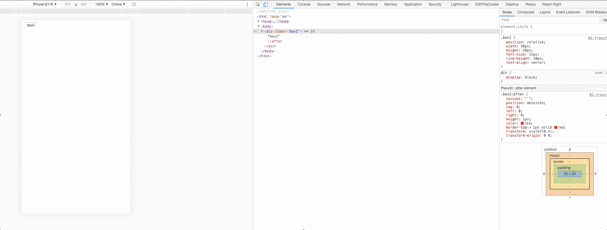
border-top
.box1 {
  position: relative;
  width: 50px;
  height: 20px;
  font-size: 12px;
  line-height: 20px;
  text-align: center;
}
.box1:after {
  content: " ";
  position: absolute;
  top: 0;
  left: 0;
  right: 0;
  height: 1px;
  color: red;
  border-top: 1px solid red;
  transform: scaleY(0.5);
  transform-origin: 0 0;
}
2
3
4
5
6
7
8
9
10
11
12
13
14
15
16
17
18
19
20
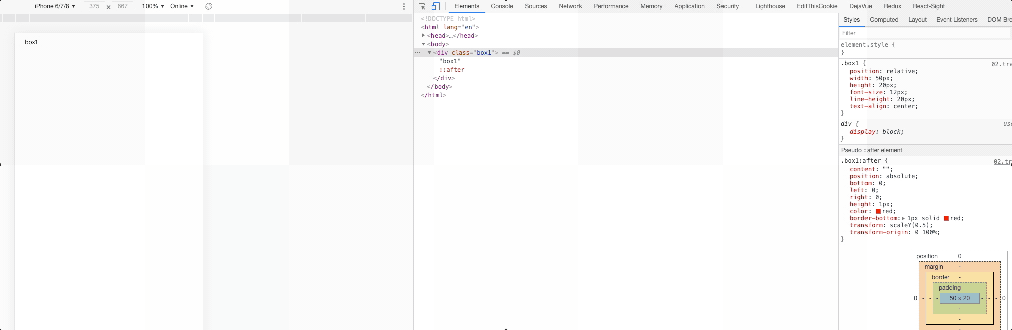
border-bottom
.box1 {
  position: relative;
  width: 50px;
  height: 20px;
  font-size: 12px;
  line-height: 20px;
  text-align: center;
}
/* 注意区分和顶部border-top的差异 */
.box1:after {
  content: "";
  position: absolute;
  bottom: 0;
  left: 0;
  right: 0;
  height: 1px;
  color: red;
  border-bottom: 1px solid red;
  transform: scaleY(0.5);
  transform-origin: 0 100%;
}
2
3
4
5
6
7
8
9
10
11
12
13
14
15
16
17
18
19
20
21
border-left
.box1 {
  position: relative;
  width: 50px;
  height: 20px;
  font-size: 12px;
  line-height: 20px;
  text-align: center;
}
.box1:after {
  content: "";
  position: absolute;
  top: 0;
  bottom: 0;
  left: 0;
  width: 1px;
  color: red;
  border-left: 1px solid red;
  transform: scaleX(0.5);
  transform-origin: 0 0;
}
2
3
4
5
6
7
8
9
10
11
12
13
14
15
16
17
18
19
20
border-right
.box1 {
  position: relative;
  width: 50px;
  height: 20px;
  font-size: 12px;
  line-height: 20px;
  text-align: center;
}
.box1:after {
  content: "";
  position: absolute;
  top: 0;
  bottom: 0;
  right: 0;
  width: 1px;
  color: red;
  border-left: 1px solid red;
  transform: scaleX(0.5);
  transform-origin: 100% 0;
}
2
3
4
5
6
7
8
9
10
11
12
13
14
15
16
17
18
19
20
transform-origin元素变换基点
- 设置或检索对象以某个原点进行转换
- 该属性提供2个参数值
- 如果提供两个,第一个用于横坐标,第二个用于纵坐标
- 如果只提供一个,该值将用于横坐标;纵坐标将默认为50%
- 默认值:50% 50%,效果等同于center center
- percentage: 用百分比指定坐标值。可以为负值。
- length: 用长度值指定坐标值。可以为负值。
- left: 指定原点的横坐标为left
- center①: 指定原点的横坐标为center
- right: 指定原点的横坐标为right
- top: 指定原点的纵坐标为top
- center②: 指定原点的纵坐标为center
- bottom: 指定原点的纵坐标为bottom
transform-3D
- 3D变换:在3D空间中进行变换
- 3D卡片
- 3D相册
- 3D立方体
# transition 过渡
复合属性。检索或设置对象变换时的过渡
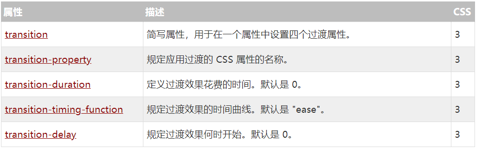
注意:
- 如果只提供一个参数,则为 <'transition-duration'> 的值定义
- 如果提供二个参数,则第一个为 <' transition-duration '> 的值定义,第二个为 <' transition-delay'> 的值定义
- 可以为同一元素的多个属性定义过渡效果,如果需要定义多个过渡属性且不想指定具体是哪些属性过渡,可以用all代替
transition-property:(参与属性)
- 检索或设置对象中的参与过渡的属性
- 默认值为:all。默认为所有可以进行过渡的css属性
- 如果提供多个属性值,以逗号进行分隔
- none: 不指定过渡的css属性
- all: 所有可以进行过渡的css属性
- <IDENT>: 指定要进行过渡的css属性
transition-duration:(持续时间)
- 检索或设置对象过渡的持续时间,默认值:0
- 如果提供多个属性值,以逗号进行分隔
- 取值: time 指定对象过渡的持续时间
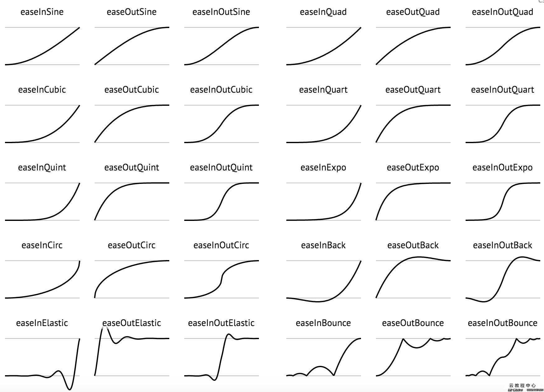
transition-timing-function:(动画类型)
- 检索或设置对象中过渡的动画类型,默认值:ease
- 如果提供多个属性值,以逗号进行分隔
- linear: 线性过渡。等同于贝塞尔曲线(0.0, 0.0, 1.0, 1.0)
- ease: 平滑过渡。等同于贝塞尔曲线(0.25, 0.1, 0.25, 1.0)
- ease-in: 由慢到快。等同于贝塞尔曲线(0.42, 0, 1.0, 1.0)
- ease-out: 由快到慢。等同于贝塞尔曲线(0, 0, 0.58, 1.0)
- ease-in-out: 由慢到快再到慢。等同于贝塞尔曲线(0.42, 0, 0.58, 1.0)
- step-start: 等同于 steps(1, start)
- step-end: 等同于 steps(1, end)
- steps(<integer>[, [ start | end ] ]?): 接受两个参数的步进函数。第一个参数必须为正整数,指定函数的步数。第二个参数取值可以是start或end,指定每一步的值发生变化的时间点。第二个参数是可选的,默认值为end
- cubic-bezier(<number>, <number>, <number>, <number>): 特定的贝塞尔曲线类型,4个数值需在[0, 1]区间内
transition-delay:(延迟时间,等一会儿)
- 检索或设置对象延迟过渡的时间,,默认值:0
- 如果提供多个属性值,以逗号进行分隔
- time:指定对象过渡的延迟时间
谷歌浏览器调试动画:
点击键盘 esc 可以出现以下控制台,调出 Animations 面板
<div class="container"></div>
/* 分解:
width 100px = 800px 属性名称  all
默认曲线
ease   匀速
ease-in
ease-out
ease-in-out 由快  -  慢   - 快

持续时间越长  动画运动的速度 越慢
持续时间越短  动画运动的速度 越快

延迟时间 2s 等待时间
*/
.container{
  width: 100px;
  height: 100px;
  background: red;
  /* 过渡动画 */
  /* 简写形式 */
  transition: all 1s;
  /* 分开写 */
  /* transition: width 1s,background 2s; */
  /* transition-timing-function: ease-in-out; */
  transition-timing-function: cubic-bezier(0.465, -0.460, 0.525, 1.435);
  /* transition-delay: 2s; */
}
.container:hover{
  width: 800px;
  background:green;
}
2
3
4
5
6
7
8
9
10
11
12
13
14
15
16
17
18
19
20
21
22
23
24
25
26
27
28
29
30
# animation 动画与交互
CSS动画库: 嘎嘎好用,😸😸
@keyframes 动画帧:
指定动画名称和动画效果
- @keyframes定义的动画名称用来被animation-name所使用
- 定义动画时,简单的动画可以直接使用关键字from和to,即从一种状态过渡到另一种状态
animation-name:(动画名)
检索或设置对象所应用的动画名称,必须与规则@keyframes配合使用,因为动画名称由@keyframes定义
- none: 不引用任何动画名称
- identifier: 定义一个或多个动画名称(identifier标识)
animation-duration: (持续时间)
检索或设置对象动画的持续时间,默认值:0s
- time 指定对象动画的持续时间
transition-timing-function:(动画类型)
检索或设置对象中过渡的动画类型,默认值:ease
- 如果提供多个属性值,以逗号进行分隔
- linear: 线性过渡。等同于贝塞尔曲线(0.0, 0.0, 1.0, 1.0)
- ease: 平滑过渡。等同于贝塞尔曲线(0.25, 0.1, 0.25, 1.0)
- ease-in: 由慢到快。等同于贝塞尔曲线(0.42, 0, 1.0, 1.0)
- ease-out: 由快到慢。等同于贝塞尔曲线(0, 0, 0.58, 1.0)
- ease-in-out: 由慢到快再到慢。等同于贝塞尔曲线(0.42, 0, 0.58, 1.0)
- step-start: 等同于 steps(1, start)
- step-end: 等同于 steps(1, end)
- steps(<integer>[, [ start | end ] ]?): 接受两个参数的步进函数。第一个参数必须为正整数,指定函数的步数。第二个参数取值可以是start或end,指定每一步的值发生变化的时间点。第二个参数是可选的,默认值为end
- cubic-bezier(<number>, <number>, <number>, <number>): 特定的贝塞尔曲线类型,4个数值需在[0, 1]区间内
animation-delay:(延迟时间)
检索或设置对象动画的延迟时间,默认值:0s
- time:指定对象动画延迟的时间
animation-iteration-count:(循环次数)
检索或设置对象动画的循环次数;
- infinite:无限循环
- number: 指定对象动画的具体循环次数
animation-direction: (是否反向)
检索或设置对象动画在循环中是否反向运动
- normal: 正常方向
- reverse: 反方向运行
- alternate: 动画先正常运行再反方向运行,并持续交替运行
- alternate-reverse: 动画先反运行再正方向运行,并持续交替运行
animation-play-state: (动画状态)
检索或设置对象动画的状态
- running: 运动
- paused: 暂停
animation-fill-mode: (动画结束后的状态)
检索或设置对象动画时间之外的状态
- none: 默认值。不设置对象动画之外的状态
- forwards: 设置对象状态为动画结束时的状态
- backwards:设置对象状态为动画开始时的状态
- both: 设置对象状态为动画结束或开始的状态

这么多属性,😔,除了背没别的了
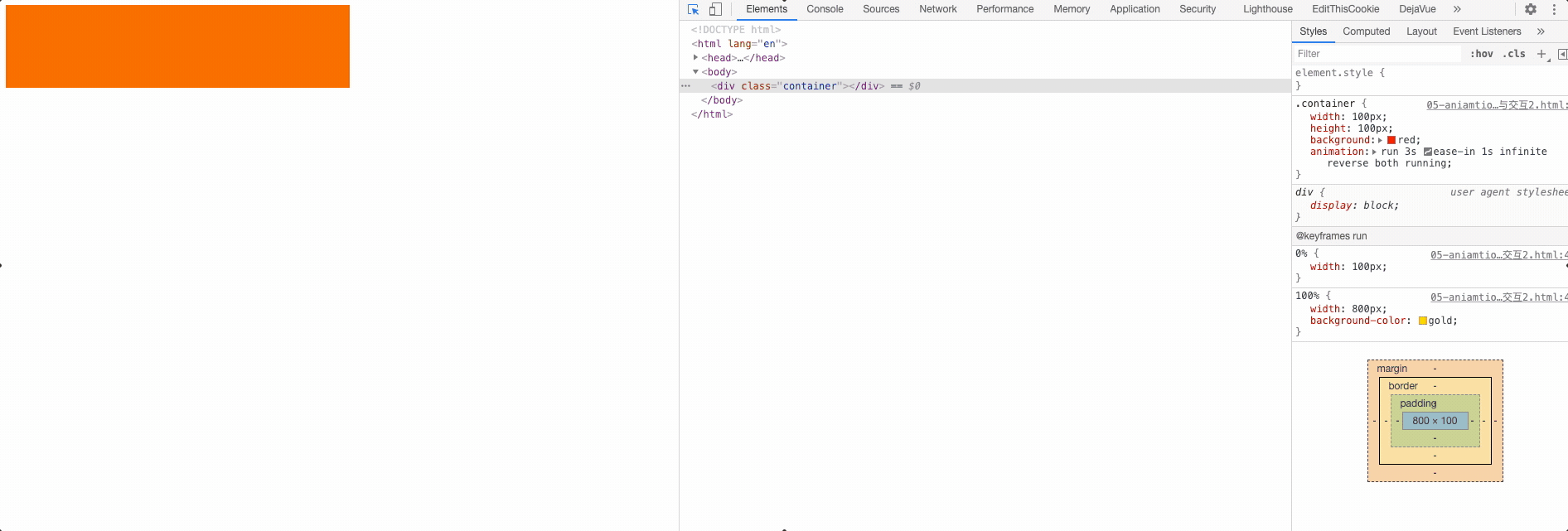
<div class="container"></div>
.container{
  width: 100px;
  height: 100px;
  background: red;
  /*
    animation-name: run; 动画名
    animation-duration: 1s; 持续时间
    animation-timing-function: linear; 运动方式
    animation-delay: 1s; 何时开始
    animation-iteration-count: infinite; 播放次数
    animation-play-state: paused; 是否暂停
    animation-fill-mode: forwards; 动画结束后的状态 forwards 结束的状态 backwards 开始状态
    animation-direction: alternate; 下一个周期是否逆向播放
  */
  /* 动画名,持续时间,动画方式,延迟时间,播放次数, 下周期是否逆转, 动画结束后状态,是否暂停*/
  animation: run 3s ease-in 1s infinite reverse both running;
}
@keyframes run {
  0% {
      width: 100px;
  }
  100% {
      width: 800px;
      background-color: gold;
  }
}
2
3
4
5
6
7
8
9
10
11
12
13
14
15
16
17
18
19
20
21
22
23
24
25
26
书写顺序好像没什么要求,会自动匹配,还是按照一定顺序写比较好。
.box {
  /* 动画名,持续时间,动画方式,延迟时间,播放次数, 下周期是否逆转, 动画结束后状态,是否暂停*/
  animation: run 3s ease-in 1s infinite reverse both running;
}
2
3
4
# 关键帧动画steps功能符深入介绍

CSS3 animation属性中的steps功能符深入介绍
逐帧动画
- 适用于无法补间计算的动画
- 资源较大
- 使用 steps()
steps() 语法:
逐步运动,简化出了 step-start 和 step-end 这两个关键字;
steps(number, position) number 数值,表示把动画分成了多少段;

position 关键字。表示动画是从时间段的开头连续还是末尾连续。支持start和end两个关键字, 默认是end。
start:表示直接开始。也就是时间才开始,就已经执行了一个距离段。于是,动画执行的5个分段点是下面这5个,起始点被忽略,因为时间一开始直接就到了第二个点

end:表示戛然而止。也就是时间一结束,当前距离位移就停止。于是,动画执行的5个分段点是下面这5个,结束点被忽略,因为等要执行结束点的时候已经没时间了

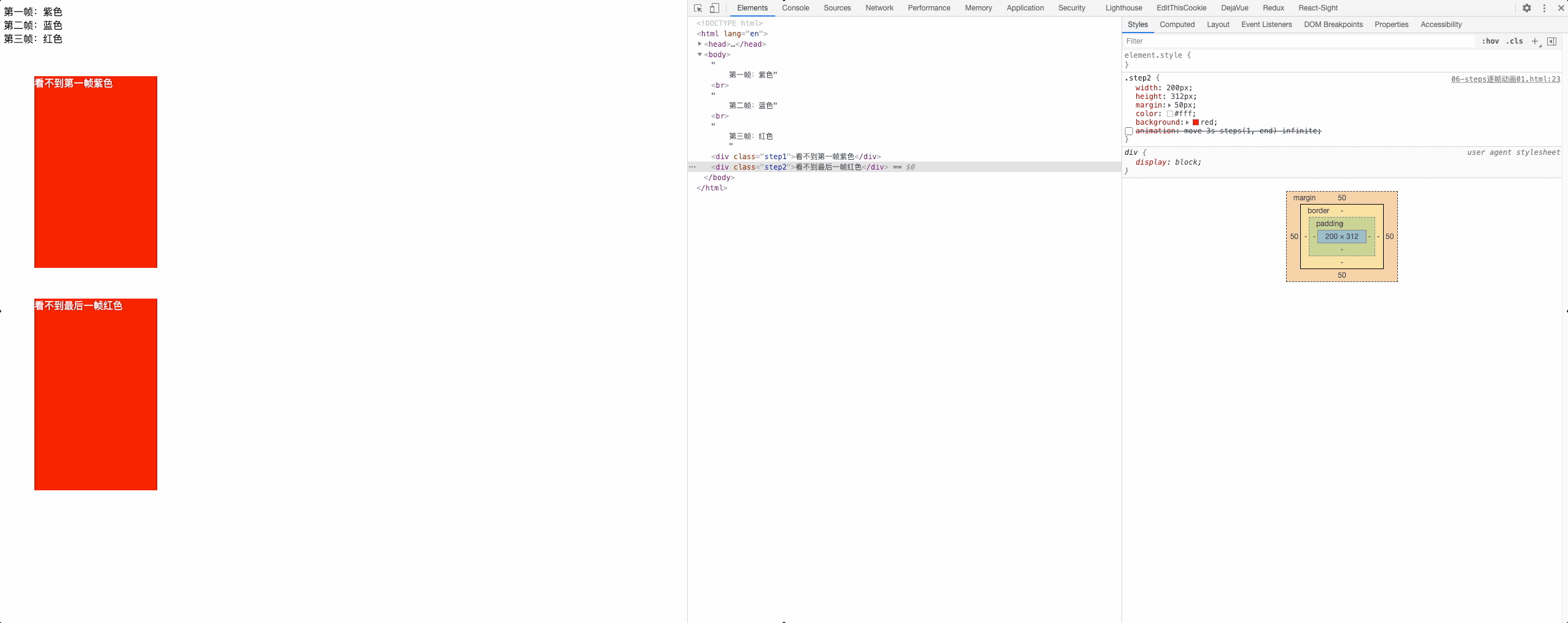
举个🌰
第一帧:紫色<br/>
第二帧:蓝色<br/>
第三帧:红色
<div class="step1">看不到第一帧紫色</div>
<div class="step2">看不到最后一帧红色</div>
2
3
4
5
/*第一个方块*/
.step1{
  width: 200px;
  height: 312px;
  margin: 50px;
  color: #fff;
  background: red;
  /*
      steps(1, start) = step-start
      跳过第一帧 0% 无效
  */
  /* animation: move 3s steps(1,start) infinite; */
}
/*第一个方块*/
.step2{
  width: 200px;
  height: 312px;
  margin: 50px;
  color: #fff;
  background: red;
  /*
      steps(1, end) = step-end
      跳过最后一桢   100% 无效
    */

  /* animation: move 3s steps(1, end) infinite; */
}
@keyframes move {
  0% {background: purple; /*紫色*/}
  50% {background: blue; /*蓝色*/}
  100% {background: red; /*红色*/}
}
2
3
4
5
6
7
8
9
10
11
12
13
14
15
16
17
18
19
20
21
22
23
24
25
26
27
28
29
30
31
32
逐帧动画,奔跑吧急支糖浆
<div class="container"></div>
/* 第一种写法:

  1.关键帧 -  多少个元素  就写多少个关键帧 steps(1)
  每个关键帧 画面只出现一个元素 = 一个关键帧对应一个元素画面
  100 / 8 = 12.5%
*/
.container{
  width: 100px;
  height: 100px;
  border: 1px solid red;
  background: url(sprites/animal.png) no-repeat;
  animation: run 1s infinite;
  animation-timing-function: steps(1);
}
@keyframes run {
  0%{
    background-position: 0 0;
  }
  12.5%{
    background-position: -100px 0;
  }
  25%{
    background-position: -200px 0;
  }
  37.5%{
    background-position: -300px 0;
  }
  50%{
    background-position: 0 -100px;
  }
  62.5%{
    background-position: -100px -100px;
  }
  75%{
    background-position: -200px -100px;
  }
  87.5%{
    background-position: -300px -100px;
  }
  100%{
    /* 最后一帧,初始状态,忽略 step(1) = step(1, end) */
    background-position: 0 0;
  }
}
2
3
4
5
6
7
8
9
10
11
12
13
14
15
16
17
18
19
20
21
22
23
24
25
26
27
28
29
30
31
32
33
34
35
36
37
38
39
40
41
42
43
44
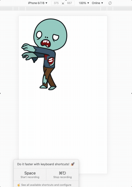
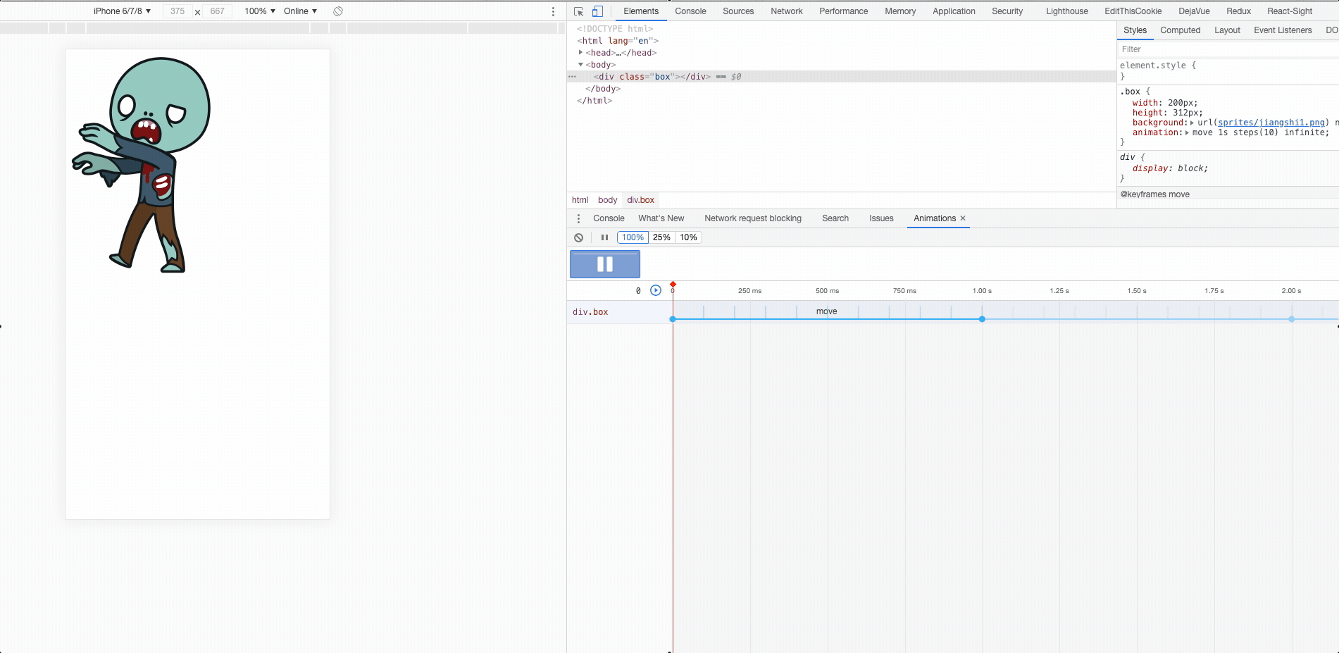
每一帧里只显示一个图片
常用写法:
<div class="box"></div>
/* 第二种写法 简化关键帧  把关键帧进行分段*/
/* 2000  *  312   10个僵尸 */
.box {
  width: 200px;
  height: 312px;
  background: url(sprites/jiangshi1.png) no-repeat;
  /*  */
  animation: move 1s steps(10) infinite; /* 🐱🐱 */
}
@keyframes move {
  /* 开始帧 */
  0% {
    background-position: 0 0;
  }
  /* 结束帧 */
  100% {
    background-position: -2000px 0;
  }
}
2
3
4
5
6
7
8
9
10
11
12
13
14
15
16
17
18
19
在来一个🌰
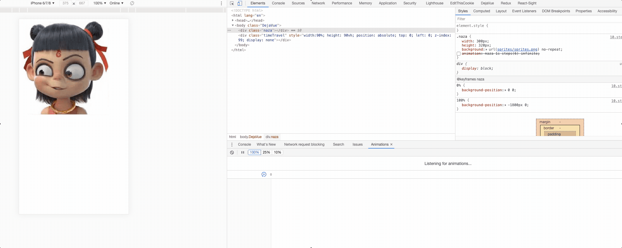
<div class="naza"></div>
/* 1800m  320   6个等分*/
.naza {
  width: 300px;
  height: 320px;
  background: url(sprites/sprites.png) no-repeat;
  animation: naza 1s steps(6) infinite; /* 🐱🐱 */
}
@keyframes naza {
  0% {
    background-position: 0 0;
  }
  100% {
    /* 雪碧图: x   y */
    background-position: -1800px 0;
  }
}
2
3
4
5
6
7
8
9
10
11
12
13
14
15
16