# CSS经典面试题
# 已知宽高实现盒子水平垂直居中
<div class="box">
  <div class="son"></div>
</div>
2
3
方案一:手动设置 margin 或者 padding
借助盒子模型属性 - margin padding
- 给子元素加间距 -
margin-top(overflow: hidden) margin-left - 给父元素加间距 -
padding-top padding-left (box-sizing: border-box)
.box {
  width: 400px;
  height: 400px;
  background-color: aqua;
  /* BFC */
  overflow: hidden;  /* 😸 😸 */
}
.son {
  width: 200px;
  height: 200px;
  background-color: rebeccapurple;
  /* 已知宽高的一半 */
  margin: 100px 0 0 100px;  /* 😸 😸 */
}
2
3
4
5
6
7
8
9
10
11
12
13
14
.box {
  width: 400px;
  height: 400px;
  background-color: aqua;
  padding: 100px 0 0 100px;   /* 😸 😸 */
  /* 开启怪异盒模型 */
  box-sizing: border-box;   /* 😸 😸 */
}
.son {
  width: 200px;
  height: 200px;
  background-color: rebeccapurple;
}
2
3
4
5
6
7
8
9
10
11
12
13
方案二:借助定位
父元素 - 相对定位 子元素 - 绝对定位
- 给父元素
position: relative - 给子元素
position: absolute top:50%; left:50% - 反向移动 margin负值 => 宽高已知
transform: translate(-50%, -50%)=> 宽高不定- 方位
top/bottom/left/right = 0 margin:auto
.box {
  width: 400px;
  height: 400px;
  background-color: aqua;
  position: relative;

}
.son {
  width: 200px;
  height: 200px;
  background-color: rebeccapurple;

  position: absolute;  /* 😸 😸 */
  top: 50%;   /* 😸 😸 */
  left: 50%;   /* 😸 😸 */
  margin: -100px 0 0 -100px;   /* 😸 😸 */
  /* 已知宽高和不已知宽高都可以用 transform */
  /* transform: translate(-50%,-50%); */
}
2
3
4
5
6
7
8
9
10
11
12
13
14
15
16
17
18
19
.son {
  width: 200px;
  height: 200px;
  background-color: rebeccapurple;
  position: absolute;  /* 😸 😸 */
  top:0;  /* 😸 😸 */
  bottom: 0;  /* 😸 😸 */
  left: 0;  /* 😸 😸 */
  right: 0;  /* 😸 😸 */
  margin: auto; /* 😸 😸 */
}
2
3
4
5
6
7
8
9
10
11
方案三:flex
display: flex;justify-content: center;水平排列 - 居中align-items: center;垂直排列 - 居中
.box{
  width: 400px;
  height: 400px;
  background-color: aqua;

  display: flex;  /* 😸 😸 */
  justify-content: center;  /* 😸 😸 */
  align-items: center;  /* 😸 😸 */

}
.son{
  width: 200px;
  height: 200px;
  background-color: rebeccapurple;
}
2
3
4
5
6
7
8
9
10
11
12
13
14
15
16
方案四:table
- 给子元素 - 水平居中 =>
width + margin: 0 auto - 给父元素 -
display:table-cell + vertical-align:middle
.box{
  width: 400px;
  height: 400px;
  background-color: aqua;

  display: table-cell; /* 😸 😸 */
  /* 垂直居中 */
  vertical-align: middle; /* 😸 😸 */
}
.son{
  width: 200px;
  height: 200px;
  background-color: rebeccapurple;
  /* 水平居中 */
  margin: 0 auto; /* 😸 😸 */
}
2
3
4
5
6
7
8
9
10
11
12
13
14
15
16
# 宽高不定实现盒子水平垂直居中
方案一:flex
justify-content: center;水平排列 - 居中align-items: center;垂直排列 - 居中
方案二:定位 + transform
transform: translate(-50%, -50%) => 宽高不定
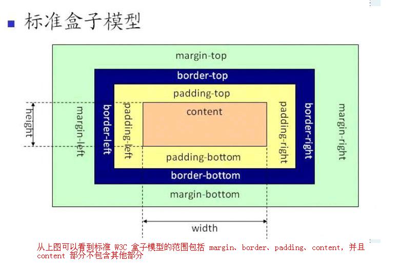
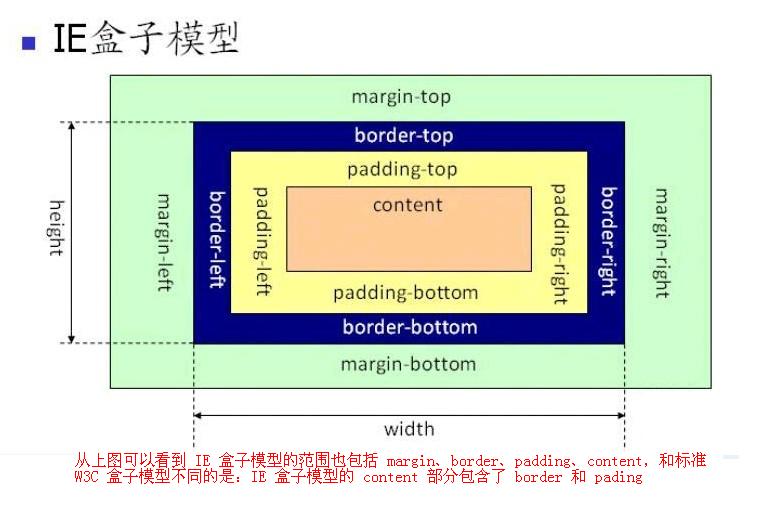
# 关于CSS3中盒模型的几道面试题
红色的content元素块面积是多少?
设置 box-sizing: border-box; 时候 盒子宽度 = 500px; 此时会压缩内容宽度
设置 box-sizing: content-box 时候 :
盒子宽度 = 500 + 40 + 20 + 10 + 10 = 580px
盒子高度 = 500 + 50 + 30 + 10 = 590px
<div class="content"></div>
.content {
  background: red;
  width: 500px;
  height: 500px;
  border: 10px solid #000;
  /* 导致上边框线失效 */
  border-top: 50px;
  padding: 50px 40px 30px 20px;
  margin: 50px 40px 30px 20px;

  /*
    坑:border-top 到底是多少  =  50 ? 10 ? 0 ?
      border-top: 复合属性 border-width border-style border-width
      只写一个宽度,是不生效的。
  */
}
2
3
4
5
6
7
8
9
10
11
12
13
14
15
16

知识点: box-sizing 顺时针 上 右 下 左
box-sizing: content-box;(默认) 标准盒模型
计算公式:
盒子宽度 = width(内容宽度) + padding-left + padding-right + border-left + border-right
盒子高度 = height(内容高度) + padding-top + padding-bottom + border-top + border-bottom
box-sizing: border-box; 怪异盒模型(IE盒模型)
计算公式:
盒子宽度 = width(已经把padding + border已经算进去了)
盒子高度 = height
# 经典布局方案:圣杯、双飞翼实现
用css实现三栏布局;左定右定中间自适应
<div class="parent">
  <div class="left"></div>
  <div class="center"></div>
  <div class="right"></div>
</div>
2
3
4
5
方法1:float + margin (注意:HTML的结构)
<div class="parent">
  <div class="left"></div>
  <div class="right"></div>
  <div class="center"></div>
</div>
2
3
4
5
.parent {
  overflow: hidden;
}
.left {
  float: left; /* 😸 😸 */
  width: 200px;
  height: 500px;
  background-color: rebeccapurple;
}
.center {
  height: 500px;
  background-color: green;
  margin-left: 210px; /* 😸 😸 */
  margin-right: 210px; /* 😸 😸 */
}
.right {
  float: right; /* 😸 😸 */
  width: 200px;
  height: 500px;
  background-color: gold;
}
2
3
4
5
6
7
8
9
10
11
12
13
14
15
16
17
18
19
20
21
方法2: float + overflow (和上面的没啥区别,注意HTML的顺序)
<div class="parent">
  <div class="left"></div>
  <div class="right"></div>
  <div class="center"></div>
</div>
2
3
4
5
.left {
  float: left;/* 😸 😸 */
  width: 200px;
  height: 500px;
  background-color: rebeccapurple;
}
.center {
  height:500px;
  background-color: green;
  overflow: hidden; /* 😸 😸 */
  margin-left: 210px;
  margin-right: 210px;
}
.right{
  float: right; /* 😸 😸 */
  width: 200px;
  height: 500px;
  background-color: gold;
}
2
3
4
5
6
7
8
9
10
11
12
13
14
15
16
17
18
19
方法3:定位
子元素(左右): position:absolute / fixed
中间子元素 : margin-left + margin-right >= width(左右)
<div class="parent">
  <div class="left"></div>
  <div class="center"></div>
  <div class="right"></div>
</div>
2
3
4
5
.parent{
  position: relative; /* 😸 😸 */
}
.left {
  width: 200px;
  height: 500px;
  background-color: rebeccapurple;
  position: absolute; /* 😸 😸 */
  top: 0; /* 😸 😸 */
  left: 0; /* 😸 😸 */
}
.center {
  height: 500px;
  background-color: green;
  margin-left: 210px; /* 😸 😸 */
  margin-right: 210px; /* 😸 😸 */
}
.right {
  width: 200px;
  height: 500px;
  background-color: gold;
  position: absolute; /* 😸 😸 */
  top: 0; /* 😸 😸 */
  right: 0; /* 😸 😸 */
}
2
3
4
5
6
7
8
9
10
11
12
13
14
15
16
17
18
19
20
21
22
23
24
25
26
方法4:flex
父元素: flex - 子元素 水平排列
子元素: (左右定宽 中 flex:1)
<div class="parent">
  <div class="left"></div>
  <div class="center"></div>
  <div class="right"></div>
</div>
2
3
4
5
.parent{
  display: flex; /* 😸 😸 */
}
.left{
  width: 200px;
  height: 500px;
  background-color: rebeccapurple;
}
.center{
  height: 600px;
  background-color: green;
  flex: 1 /* 😸 😸 */
}
.right{
  width: 200px;
  height: 500px;
  background-color: gold;
}
2
3
4
5
6
7
8
9
10
11
12
13
14
15
16
17
18
方案5:table
父元素 : display:table + width:100%
子元素 : display:table-cell (td)
<div class="parent">
  <div class="left"></div>
  <div class="center"></div>
  <div class="right"></div>
</div>
2
3
4
5
.parent {
  display: table; /* 😸 😸 */
  width: 100%; /* 😸 😸 */
}
.left,
.right {
  display: table-cell; /* 😸 😸 */
}
.left {
  width: 200px;
  height: 500px;
  background-color: rebeccapurple;
}
.center {
  height: 600px;
  margin-left: 20px;
  margin-right: 20px;
  background-color: green;
}
.right {
  width: 200px;
  height: 500px;
  background-color: gold;
}
2
3
4
5
6
7
8
9
10
11
12
13
14
15
16
17
18
19
20
21
22
23
24
圣杯、双⻜翼布局的区别
优先加载中间的结构
<div class="parent">
  <div class="center"></div>
  <div class="left"></div>
  <div class="right"></div>
</div>
2
3
4
5
圣杯布局
<div class="parent">
  <div class="center"></div>
  <div class="left"></div>
  <div class="right"></div>
</div>
2
3
4
5
.parent {
  padding-left: 210px;
  padding-right: 210px;
  overflow: hidden;
  margin-bottom: 100px;
}
.left {
  width: 200px;
  height: 400px;
  background-color: green;
}
.center {
  width: 100%;
  height: 400px;
  background-color: rebeccapurple;
}
.right {
  width: 200px;
  height: 400px;
  background-color: hotpink;
}

/* 三个列水平排列  - float */
.left,
.center,
.right {
  float: left;
}

/*
  把left 和 right 移动它原本的位置
  left在center前面
  right在center后面 => margin负值技巧
*/
.left {
  margin-left: -100%;
}
.right {
  margin-left: -200px;
}

/*
  移动到我们理想的位置 - 借助position进行移动
*/
.left {
  position: relative;
  left: -210px;
}
.right {
  position: relative;
  right: -210px;
}
2
3
4
5
6
7
8
9
10
11
12
13
14
15
16
17
18
19
20
21
22
23
24
25
26
27
28
29
30
31
32
33
34
35
36
37
38
39
40
41
42
43
44
45
46
47
48
49
50
51
52
双飞翼:优化了 position , 但是结构多加了一个
<div class="parent1">
  <div class="center-wrap">
      <div class="center1"></div>
  </div>
  <div class="left1"></div>
  <div class="right1"></div>
</div>
2
3
4
5
6
7
/* 双飞翼  -  没有定位的代码  */
.parent1 {
  overflow: hidden;
}
.left1 {
  width: 200px;
  height: 400px;
  background-color: green;
}
.center-wrap {
  width: 100%;
}
.center1 {
  margin-left: 210px;
  margin-right: 210px;
  height: 400px;
  background-color: rebeccapurple;
}
.right1{
  width:200px;
  height:400px;
  background-color: hotpink;
}

/* 三个列水平排列  - float */
.left1,
.center-wrap,
.right1 {
  float: left;
}

/*
  直接移动到理想的位置 -  把定位的代码给优化掉了
  方位 - left移动
*/
.left1 {
  margin-left: -100%;
}
.right1 {
  margin-left: -200px;
}
2
3
4
5
6
7
8
9
10
11
12
13
14
15
16
17
18
19
20
21
22
23
24
25
26
27
28
29
30
31
32
33
34
35
36
37
38
39
40
41
# 移动端响应式布局开发的三大方案
CSS响应式布局
=>  单位: vw +  vh

=> 单页面 后台系统 rem + %

=>  @media + viewport

=>  flex
2
3
4
5
6
7